Welcome to the artfeed Heather! This curved tone bar is looking good. Your toning is nice and smooth, and you are getting good saturation of color. Love the shimmery highlight!!
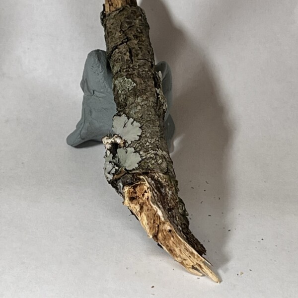
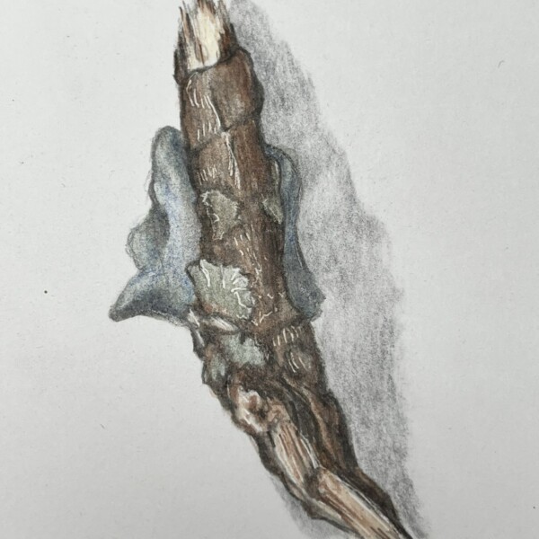
The kneaded eraser is cracking me up. This branch is off to a great start! I can tell that you really observed this closely while drawing it – nice@ One of the things that can be difficult with detailed subjects like this is keeping the 3D form. Sometimes we need to push the shadows and highlight a bit to create that 3 dimensional illusion, even when we really don’t see those shadows and highlights on our subject. So, although you aren’t seeing much of a highlight in your reference photo, you still want to put a bit of a highlight in there, just like you would when toning a cylinder. On something matte like this branch, you probably wouldn’t want to leave that highlight as the white of the paper, but you still want that highlight area (approx 1/4 of the way in from the left) to be quite light. You can try lifting out that area with your eraser a bit. Be careful with cast shadows – we try not to make them too important in botanical art. You want them to be very subtle. If you have Wendy’s “The Joy of Botanical Drawing” book, on page 43 there is a good example of a subtle cast shadow. You can go into this drawing with a kneaded eraser and try lifting out a lot of it. There is another common cast shadow mistake that I’m seeing here is a thin white “halo” between the subject and the cast shadow. You want that shadow to start right at the edge of the subject, and then quickly and gradually fade it out, getting lighter and lighter until it just fades into the white of the paper. I would love to see you draw another branch, pushing that 3D form by exaggerating the highlight and form shadow a bit. If you need the kneaded eraser to keep the branch from moving, you might want to use a smaller piece and keep it hidden, or just imagine it’s not there when you draw it so that it doesn’t distract from that beautiful branch. Can’t wait to see more!!
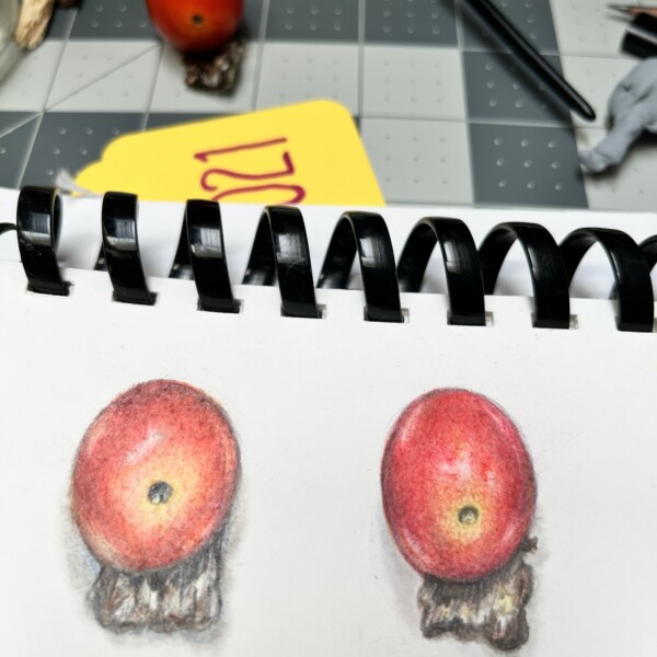
Looking good! Great toning and color matching! And I love the shadow on that little spot where the stem attaches – it’s receding nicely into the tomato. Your highlights are nice and shimmery, and your shadow colors are great. It looks like your light source isn’t quite right – it should be shining down on your subject from the upper left at about a 45 degree angle (if you are right-handed). Even when you are in a situation where you can’t set up your subject in that direct scientific lighting, you want to imagine that it’s being lit from the upper left, and apply that “formula” to your drawing. (So, your main highlight would shift to the left of center, and your form shadow would be on the right). The more you light things in the “correct light” the more it will get into your head, and the easier it will be to know what the light is “supposed” to look light. Hope that makes sense!
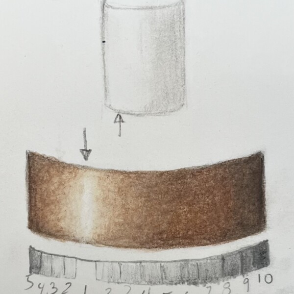
Welcome to the artfeed Heather! This curved tone bar is looking good. Your toning is nice and smooth, and you are getting good saturation of color. Love the shimmery highlight!!
The kneaded eraser is cracking me up. This branch is off to a great start! I can tell that you really observed this closely while drawing it – nice@ One of the things that can be difficult with detailed subjects like this is keeping the 3D form. Sometimes we need to push the shadows and highlight a bit to create that 3 dimensional illusion, even when we really don’t see those shadows and highlights on our subject. So, although you aren’t seeing much of a highlight in your reference photo, you still want to put a bit of a highlight in there, just like you would when toning a cylinder. On something matte like this branch, you probably wouldn’t want to leave that highlight as the white of the paper, but you still want that highlight area (approx 1/4 of the way in from the left) to be quite light. You can try lifting out that area with your eraser a bit. Be careful with cast shadows – we try not to make them too important in botanical art. You want them to be very subtle. If you have Wendy’s “The Joy of Botanical Drawing” book, on page 43 there is a good example of a subtle cast shadow. You can go into this drawing with a kneaded eraser and try lifting out a lot of it. There is another common cast shadow mistake that I’m seeing here is a thin white “halo” between the subject and the cast shadow. You want that shadow to start right at the edge of the subject, and then quickly and gradually fade it out, getting lighter and lighter until it just fades into the white of the paper. I would love to see you draw another branch, pushing that 3D form by exaggerating the highlight and form shadow a bit. If you need the kneaded eraser to keep the branch from moving, you might want to use a smaller piece and keep it hidden, or just imagine it’s not there when you draw it so that it doesn’t distract from that beautiful branch. Can’t wait to see more!!
Looking good! Great toning and color matching! And I love the shadow on that little spot where the stem attaches – it’s receding nicely into the tomato. Your highlights are nice and shimmery, and your shadow colors are great. It looks like your light source isn’t quite right – it should be shining down on your subject from the upper left at about a 45 degree angle (if you are right-handed). Even when you are in a situation where you can’t set up your subject in that direct scientific lighting, you want to imagine that it’s being lit from the upper left, and apply that “formula” to your drawing. (So, your main highlight would shift to the left of center, and your form shadow would be on the right). The more you light things in the “correct light” the more it will get into your head, and the easier it will be to know what the light is “supposed” to look light. Hope that makes sense!
(supposed to look *like*)
Ah – I was wondering about the ‘highlights’ on the matte branch. I’ll work on that – and tone down the shadows!
I just discovered only have “Botanical Drawing in Color” – I’ll get the “Joy of…” and take a lok.