Pleasing compositions rarely happen by accident. We arrange the components until we are satisfied. How do you know you’ve found your final arrangement? It may feel like a gut instinct, like you’re not sure exactly why, but something about it just looks “right.” Here is a free composition quick guide to help you create compelling botanical illustrations.
Most pleasing compositions are arranged with these 6 elements in mind:
1. Focal Point
2. Balance
3. Movement
4. Proportion of Elements
5. Depth & Contrast
6. Unity
1. Focal Point
Go outside, listen… with your eyes, and find a plant that interests you. What first attracts you? What aspect in particular drew you to this plant?
Choose the most compelling part (often identifying characteristics, such as flowers, unusual seed pods or leaf arrangements) to be your focal point.
Follow these helpful tips to create a strong focal point:
+ Always begin a rendering with your focal point.
+ Render more detail in the foreground.
+ Render less detail in supporting elements and those further back in space.
+ Use more contrast and saturation of color in front, with less finishing details in back.
+ Use warmer and brighter colors in front, as they appear to move forward.
+ Use cooler and grayer colors behind, as they appear to recede.
+ Start your color rendering at the focal point! Avoid the pitfall of adding color at one edge of your drawing and working toward the center, as if you are filling in a coloring book. This can lead to finished drawings that appear incomplete.
+ Avoid focus on abnormalities or scars. In a botanical drawing, the plant is the star of the show. A focal point that misrepresents the plant’s typical features can be confusing for viewers.
2. Balance
A balanced page sometimes has elements evenly distributed around the page. There are no overpowering areas, neither too much empty space nor too many elements crowded together.
Imbalance can be good too, sometimes! Remember, there are no “rules” as long as your composition accomplishes what you want it to. For example, you could create a focal point and then arrange elements around it filling some of the space (but not always evenly!) until you are pleased with your composition.
3. Movement
The elements should guide the viewer around the page, but not pull them off the page by an overwhelming direction such as a diagonal.
Think of your page as a wedding dance floor – you want your eyes to dance across the entire dance floor, but you don’t want them to spin off the dance floor (and into a nearby table!).
4. Proportion of Elements
Create the illusion of some elements appearing in front and others behind with accurate size and correct proportion. When something is closer to you, it appears larger, and when it’s farther away, it appears smaller.
Look out your window, and picture an airplane soaring in the sky. It appears tiny, right? But when you go to the airport (and finally get through security to boarding), that plane appears to be pretty huge! Did the plane change size?! No… you just looked at it from a different perspective.
This is why we measure against an imaginary picture plane, so that our subjects appear proportionally from our perspective.
Challenge: 3+ Components
A complex composition of a plant should show at least three of these components:
+ Reproductive Parts, Flowers, Petals
+ Stems
+ Leaves
+ Fruit, Berries, Seedpods
+ Roots, Bulbs
+ Habit Drawings
Using just one or two of the above components is also perfectly acceptable. Simple compositions are beautiful too!
5. Depth & Contrast
Create the feeling of a foreground, perhaps a middle ground, and a background to give your composition the illusion of depth.
Tone your subject with a seamlessly blended, complete range of 9-10 values from dark to light. The continuous toning allows the viewer’s eye to move across your form in a three-dimensional way.
Sketch your outline lightly in graphite pencil before switching to colored pencils for toning. Avoid creating a dark outline!
When deciding which view of your subject to draw, choose a view that will look three-dimensional.
Learn more about how to create a good sense of volume on your form to further enhance the illusion of depth in this free step-by-step tutorial for drawing a tulip (can be applied to any subject!).
6. Unity
Elements should relate to each other and express harmony and wholeness. This does NOT mean that all of your composition’s components must be overlapping!
Want to learn more?
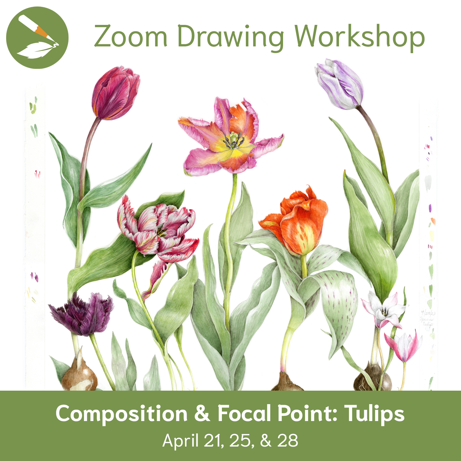
Don’t miss our Zoom Drawing Workshop – Composition & Focal Point with Tulips! Starts April 21 (or watch the recording later!).
Want constructive feedback on your own compositions?
Join The Practice of Botanical Drawing Complete Course to receive comments on the Art Feed and participate in further discussions at our monthly Webinar. (Plus there’s a great video lesson and downloadable PDF all about Composition!)