Spirals are In!
Paper Testing
I’ve been taking my paper for granted for the past 15 years. Back then, I began a love affair with the materials I still use today to create my botanical art. I work with a combination of colored pencils (Faber Castell polychromos oil based pencils) and watercolor, either in the form of Albrect Durer Watercolor pencils or standard watercolors from Windsor Newton. My paper has always been Fabriano Artistico Hot Pressed watercolor paper, usually 140 lbs. You could say I had an obsession with the combination of the pencils, the watercolors and the paper. Over the years, I have tried many techniques and have occasionally worked on other papers, but by and large, I have been loyal to my paper and pencils.
You can imagine how upset I was to find out a year ago that my beloved paper had changed and was no longer dependable. Besides the fact that I needed to find a new paper to use for my professional work, I also produce custom-made sketchbook pads of this paper for my students to purchase. I encourage my students to use the best paper possible, and I have always recommended my favorite Fabriano. So now, what would I recommend and use for my pads in the future?
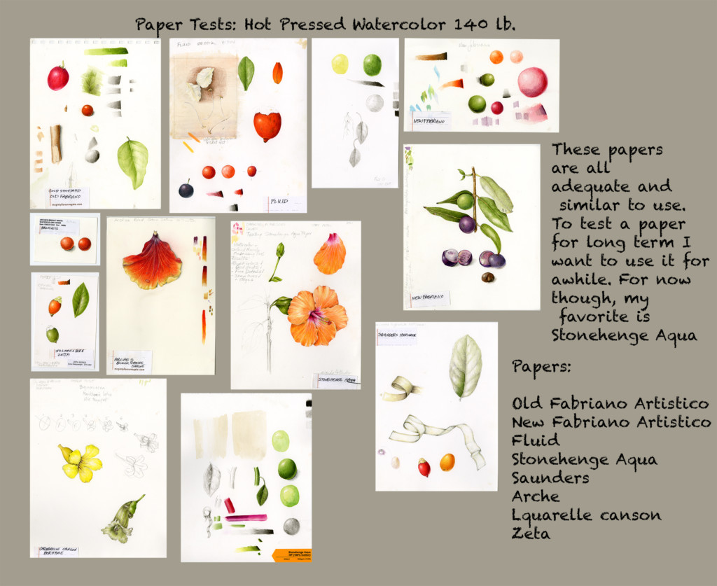
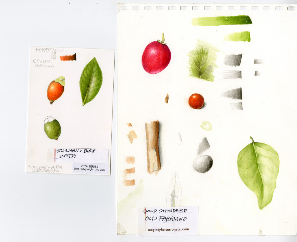
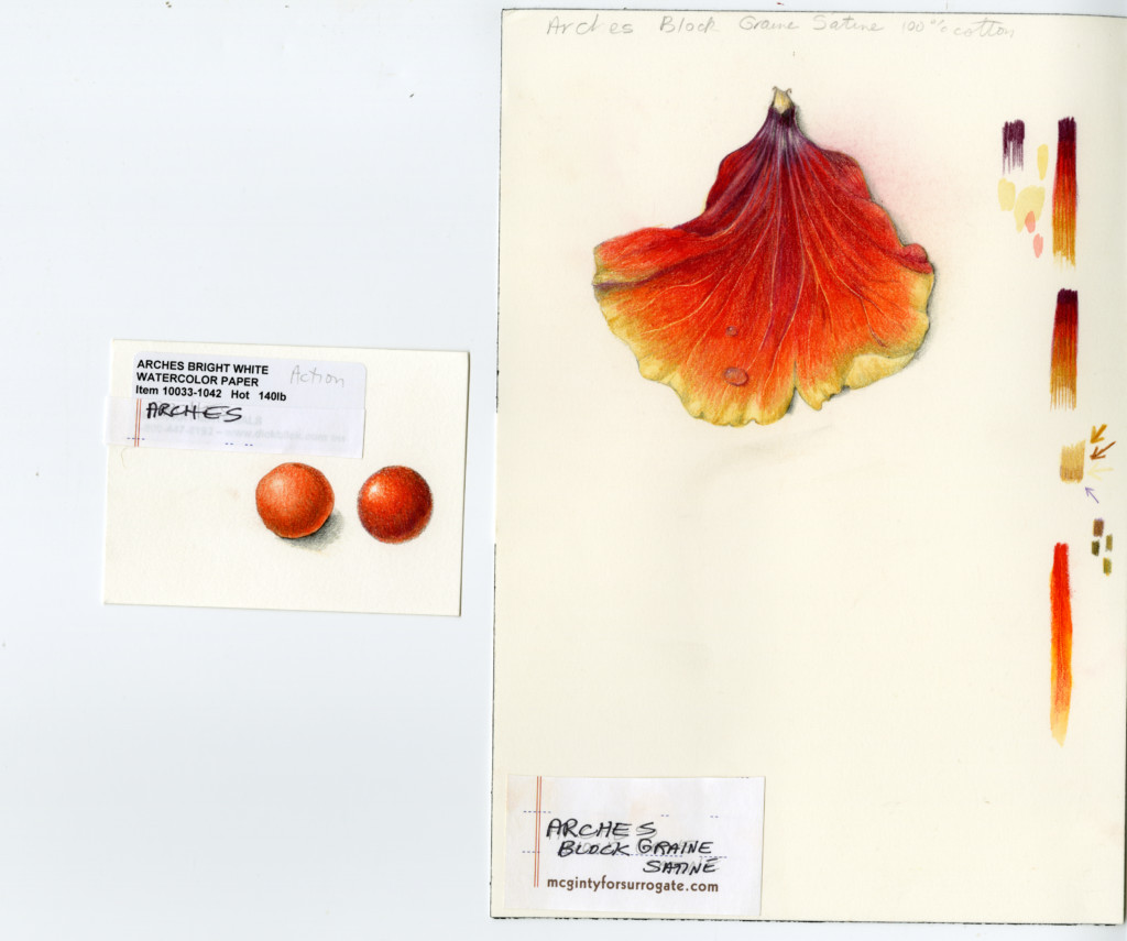
Eight weeks ago, I decided it was time to start testing different papers. I came up with a criteria for what is important to me in a paper and started drawing test squares and blends on these papers. I quickly realized that testing a paper is not the same as actually trying to work on a paper for a real drawing or painting. When you test a paper you don’t really challenge the paper. So I chose my best papers from the initial test and then started doing detailed small drawings on them.
The most important thing that I realized was that I was so dependent on my old Fabriano paper. I knew exactly how it would behave and how to work with it. These new papers all felt different and each paper required me to use it differently. I soon realized, though, that actually several of these papers could all work fine if I took the time to work on them carefully. In a way, I now feel liberated because I know that you could give me any paper, and I will make it work. I can get used to a new paper now, whereas before I could only feel comfortable working on one brand of paper.
Here is what I think is important in a paper choice for drawing with colored pencil and watercolor:
Paper Requirements for Botanical Art:
- Should not buckle too much from wet watercolor application
- Should allow for control of watercolor (doesn’t spread too much) so that fine details can be used
- Should not be too rough
- Smooth surface, but not too smooth
- Should not be so smooth that it is slippery, because then it is not able to receive the extensive layers of pencil and watercolor that I like to apply
- Should allow for rendering fine lines
- Should get really good darks
- Should get bright, clear colors
- Should blend colors together smoothly
- Receives many many layers of pencil and paint
- Never get a waxy build up
- Texture of surface should be fine enough so a pencil point does not dull too quickly
- Should be able to erase and lift some watercolor
Other Considerations:
Paper price and availability are important. I care about price and ease in getting a paper delivered so I can make a good product. I am partial to working with an American company though all the handmade papers I use are manufactured in Europe. In the end I came up with two papers that I liked.
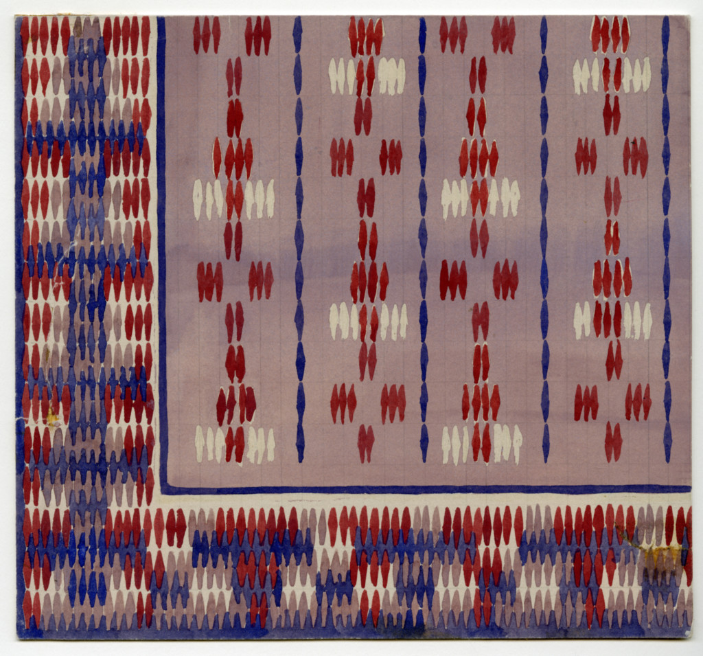
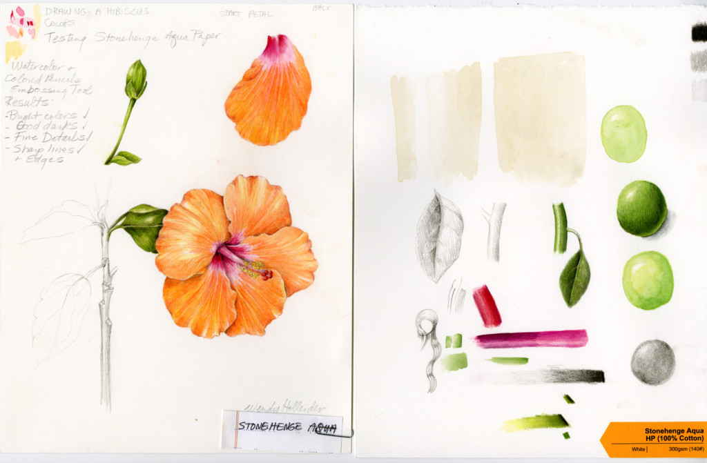
In contacting the companies that make the two papers I liked best, I realized I had a long history with one company, Legion Paper, that makes a new paper called Stonehenge Aqua. I was familiar with the name Stonehenge, as I used this paper back in the 1980’s when I was a textile designer. I remember the paper well, originally a printmaking paper in several nice colors. I chose my paper in those days partially by color as it was important to have a good background color for the design. I often used Stonehenge in light gray. Here is one of my textile designs from the 1980’s.
Basket texture textile by Wendy Hollender. Guache on Stonehenge paper. Copyright 1982.
Stonehenge Aqua
I spoke with the owner of Legion and could sense that he shared my enthusiasm for a good paper. I was very interested in how he developed this new paper and was excited that the company is located in NY/NJ (in my neck of the woods). The paper has all the qualities I look for, plus it is reasonably priced.
They purposely left off a watermark so the whole sheet is usable with two deckled edges.

Here is what Legion says about it’s new paper:
“Stonehenge Aqua is about the endless possibilities of an extraordinary watercolor paper.
Wet-on-wet or wet-on-dry, it has a wonderful crispness that anchors beautiful work across every task and technique. With Stonehenge Aqua, blending is effortless, lifting is no longer a chore. It welcomes masking while never relinquishing the control you both demand and desire. Bright colors dry bright. Blocks or sheets, it is flat paper that dries flat.
Coldpress or Hotpress, Stonehenge Aqua is everything an expensive paper is without the expense.”
SPECIFICATIONS:
- 100% Cotton
- Neutral pH
- Acid Free
- Chlorine Free
- 2 deckles, 2 cut edges (sheets)
- Sized for watercolor
- Superior quality
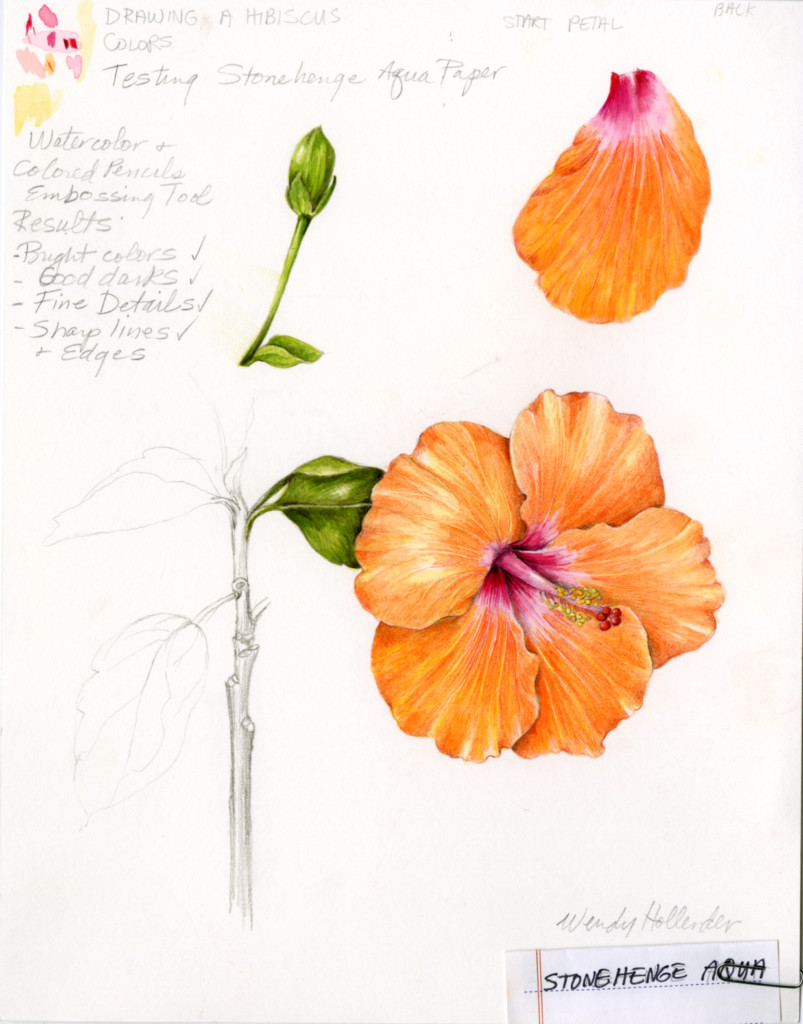
Original Botanical Illustration of a Hibiscus by Wendy Hollender for a test of Stonehenge Aqua Paper.
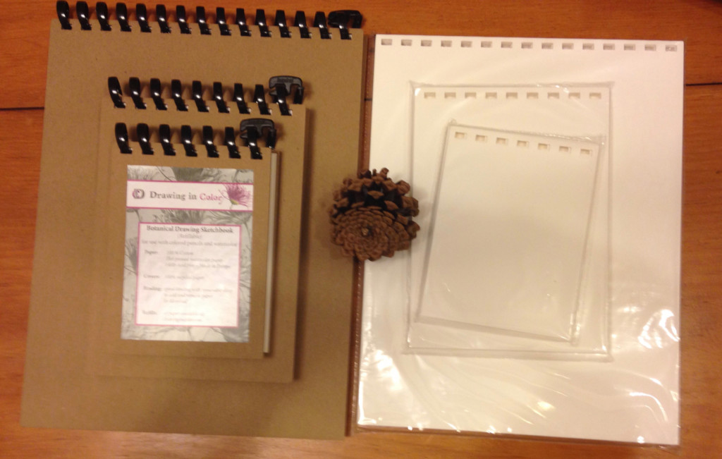
Order pads of paper here.
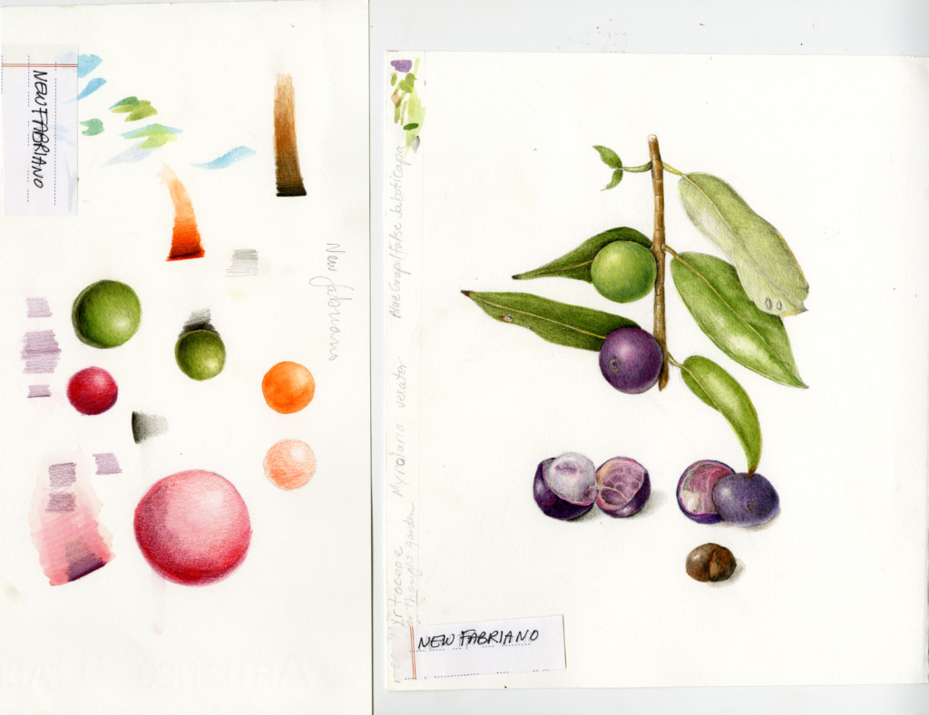
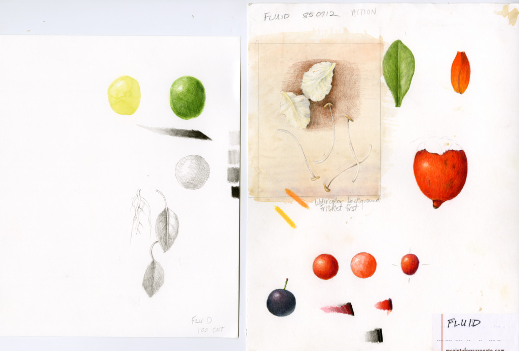
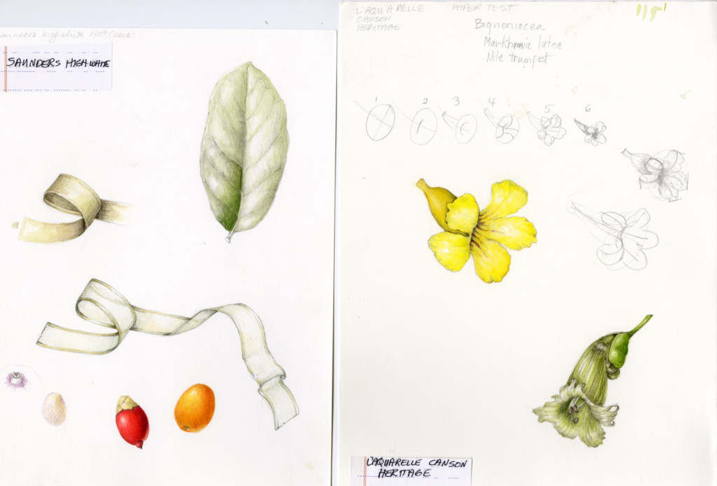
Here are all my paper trials of the papers I like.
