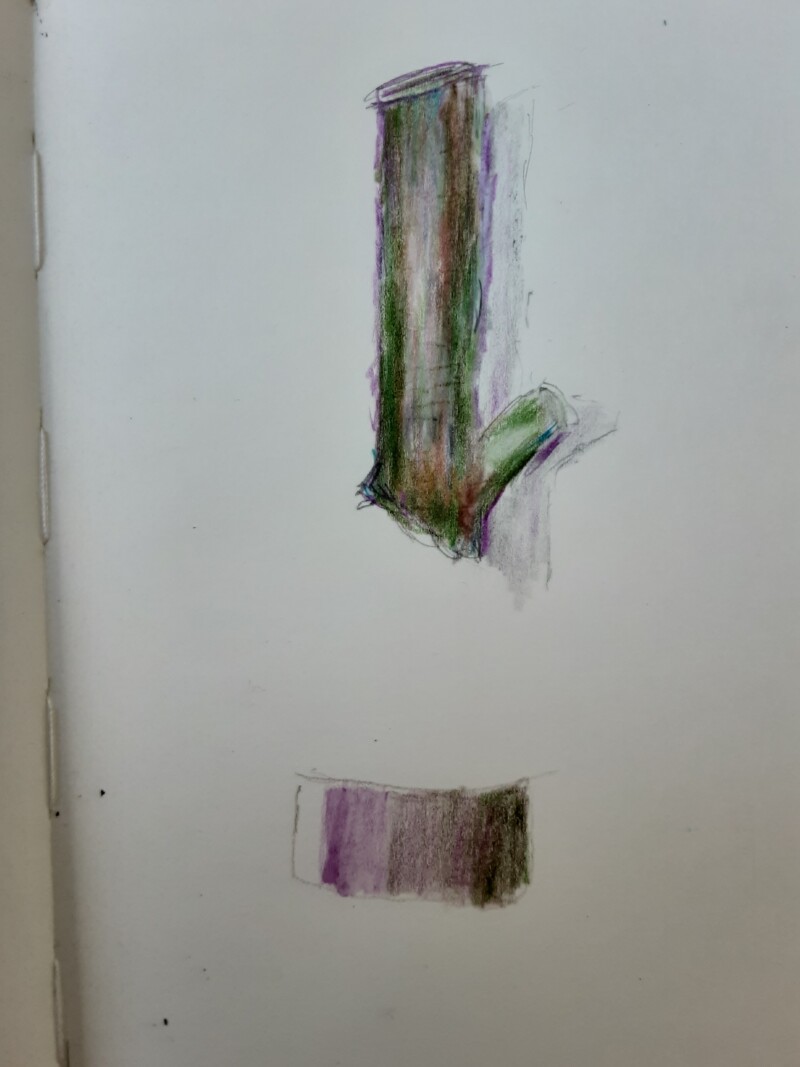
Hi Daniel- welcome to the ArtFeed! Seeing this in these colors is refreshing to see! With the tone arc bottom the left edge should be 3-4 on the tone scale and transition lighter as it moves right toward the highlight. The tone to the right of the highlight is too dark. It should just be slightly darker. As the tones transition to the darkest tone on the right side you should not be able to see the seams of tone. The branch segment is really nice! The main highlight is a touch too centered and should move to the left a little. Your style is definitely looser than what we do, but it is really appealing and I look forward to seeing more of your work!
Hi Doug. Thank you for your valuable critique. I am not satisfied with the paper quality I chose. I will correct the sharpness and tightness. Again thank you.