Bravo Jette- this looks fantastic!!! To start with your rendering is great and you followed that up with capturing the colors and doing a great job on the highlights, toning and shadows! There are two small areas I would point out. The top leaf on the left could use a little toning on the bottom of the leaf near the end where it curls around. Right where it curls there should be a little shadow toning. The highlight on the bottom leaf on the left would be more like how you did that area on the leaf above it. Congratulations Jette!
Thanks Doug – very helpful – I can see both of your suggestions when you remind me. A thought – what if I had only coloured some of the leaves and done the others in graphite – is this appropriate? or should all be coloured. Thank you Jette
Hi Jette- mixing mediums is definitely an option and it can be quite effective. I personally love graphite artwork (either total or mixed applications) and really enjoy doing it. I have mixed graphite (or dark sepia) and color pencil work many times – usually on larger drawings, but any drawing where I thought the piece as a whole would be easier to understand if everything was not in color. I tend to think it is most successful when the drawing has a lot of parts or is complicated in other ways and composition can be a big factor too. Having seen your beautiful beech drawing done all in color, I love it the way it is and I don’t know if this is where I would have tried a mixed application. I would definitely encourage you to try it though! Be aware that if you start something in graphite and there is a possibility that you may add color later, do the drawing in a dark sepia or black color pencil instead. I have found layering color pencil on top of graphite does not work well. Sheila recently posted a drawing on the ArtFeed of a Greviella (sp) flower where some of the components are in graphite and I thought it was very well done and effective. You can check that out and also look at applicable botanical drawings on line. There are so many possibilities to explore!
Me again- I just went back to look at Sheila’s drawing that I recommended you check out and I saw Vern’s drawing again with another variety of a Grevillae. Some of the leaves are being viewed from the back, so the color is lighter and don’t have the same detail and Vern also probably intentionally did that. This is a different technique, but similar to mixing black/white and color on a page. Vern’s drawing works so well because the stem and flower are such complicated subjects and they are being allowed to be the stars of the page. This is a great example when there are multiple items on a page and how you communicate what you want to be the focus of your page. Food for thought!
27 March 2020
Beautiful work, Jette! You did a great job showing form and structure here: the way the leaves attach to this branch, the serrated leaf margins, the way the buds are arranged. Very nice attention to detail. The colors here are very nice, and I like that you varied them a little bit, so that each leaf does not feel exactly the same. Great job with your rolling leaves; I think with those little tweaks that Doug mentioned, those rolling areas will come to life. Re: graphite, I think it’s always a challenge to decide something like that. Take a look at some of Wendy’s drawings where a few of the leaves will “fade out” into just a graphite line drawing, sometimes with a hint of watercolor. I think that this can be effective in compositions where there are SO MANY leaves that rendering all of them to the same saturation could make the drawing feel “heavier” than it wants to be. Ultimately, it’s up to your personal taste, but if you are doing a traditional botanical illustration that could be used for identification purposes, it would be good to show at least a few of the leaves colored to match the subject. Hope that helps. 🙂 Really great job here.
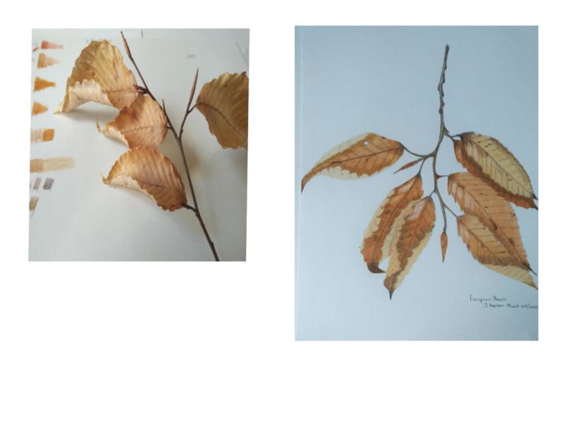
Hello – unfortunately my specimen fell apart while I was working so I dont have a great photo. Working on a variety of curling leaves.
Beautiful! I love how beech trees hold onto their leaves all winter. I don’t know why, but it’s comforting to me. I love the colors.👏👏👏
Thank you Pam – appreciate your positive comments.
Bravo Jette- this looks fantastic!!! To start with your rendering is great and you followed that up with capturing the colors and doing a great job on the highlights, toning and shadows! There are two small areas I would point out. The top leaf on the left could use a little toning on the bottom of the leaf near the end where it curls around. Right where it curls there should be a little shadow toning. The highlight on the bottom leaf on the left would be more like how you did that area on the leaf above it. Congratulations Jette!
Thanks Doug – very helpful – I can see both of your suggestions when you remind me. A thought – what if I had only coloured some of the leaves and done the others in graphite – is this appropriate? or should all be coloured. Thank you Jette
Hi Jette- mixing mediums is definitely an option and it can be quite effective. I personally love graphite artwork (either total or mixed applications) and really enjoy doing it. I have mixed graphite (or dark sepia) and color pencil work many times – usually on larger drawings, but any drawing where I thought the piece as a whole would be easier to understand if everything was not in color. I tend to think it is most successful when the drawing has a lot of parts or is complicated in other ways and composition can be a big factor too. Having seen your beautiful beech drawing done all in color, I love it the way it is and I don’t know if this is where I would have tried a mixed application. I would definitely encourage you to try it though! Be aware that if you start something in graphite and there is a possibility that you may add color later, do the drawing in a dark sepia or black color pencil instead. I have found layering color pencil on top of graphite does not work well. Sheila recently posted a drawing on the ArtFeed of a Greviella (sp) flower where some of the components are in graphite and I thought it was very well done and effective. You can check that out and also look at applicable botanical drawings on line. There are so many possibilities to explore!
Me again- I just went back to look at Sheila’s drawing that I recommended you check out and I saw Vern’s drawing again with another variety of a Grevillae. Some of the leaves are being viewed from the back, so the color is lighter and don’t have the same detail and Vern also probably intentionally did that. This is a different technique, but similar to mixing black/white and color on a page. Vern’s drawing works so well because the stem and flower are such complicated subjects and they are being allowed to be the stars of the page. This is a great example when there are multiple items on a page and how you communicate what you want to be the focus of your page. Food for thought!
Beautiful work, Jette! You did a great job showing form and structure here: the way the leaves attach to this branch, the serrated leaf margins, the way the buds are arranged. Very nice attention to detail. The colors here are very nice, and I like that you varied them a little bit, so that each leaf does not feel exactly the same. Great job with your rolling leaves; I think with those little tweaks that Doug mentioned, those rolling areas will come to life. Re: graphite, I think it’s always a challenge to decide something like that. Take a look at some of Wendy’s drawings where a few of the leaves will “fade out” into just a graphite line drawing, sometimes with a hint of watercolor. I think that this can be effective in compositions where there are SO MANY leaves that rendering all of them to the same saturation could make the drawing feel “heavier” than it wants to be. Ultimately, it’s up to your personal taste, but if you are doing a traditional botanical illustration that could be used for identification purposes, it would be good to show at least a few of the leaves colored to match the subject. Hope that helps. 🙂 Really great job here.