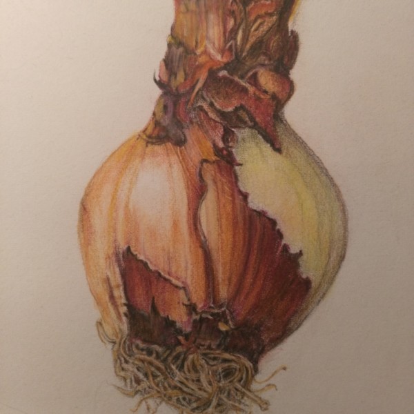
Hi Maureen- Amaryllis bulbs are a challenge and so fun to draw! You have captured all the different textures. There are a couple of areas I would revisit. The right side could use some more shading to enhance the form of the bulb. There are so many layers in the top and it doesn’t have the same crispness or detail that you have achieved on the rest of the bulb. You might try going back with verithin pencils to define the various edges and details. Good job.
Hi Doug, I know the right side needs adjusting to harmonize with the detail in other areas, the right side has been burnished so wondering how extensively to apply the verithin. So tricky for me but I had so much fun with this as I fell into the luminous skin of the bulb
Hi Maureen- I would probably use the terra cotta and dark brown verithins on the top section and outline the various edges of the dried out stem to make them crisper and define the details. Keep in mind that some areas are going to have a highlight and some areas will be shaded. Take another look if you still have the bulb. I think there may be more details you could add to the top stem part that could easily be added with the verithins. A lot of those layers on the stem have a paper quality to them. I often go back with the polychrome dark sepia (using very light layers) to deepen the shading especially if that is the color I used for the grisailles (initial toning). Since the color on right side of the bulb is light like an onion I would experiment on scrap paper to see which color to use to deepen the shading. Maybe a brown and/or green would be best to darken the right side of the bulb. You will be able to add more layers even though you have burnished. I submitted an image of an amaryllis bulb to the ArtFeed back on November 21 if you want to check it out.
Hi Doug, I just had a peek at your Amaryllis bulb, are you working up a lot of those fine details in the beginning with graphite? I think I will choose green for deepening right side of bulb as those luminous blue/greens are what pull my attention to the particular view I chose. I kind of wonder in future if I should position lighter side of plant where the highlight falls, might have been simpler ! Thanks for your tips and appreciate your feedback on how to achieve those tiny details I am seeing in your work
Hi Maureen- I agree with you and Vern that in the future it would be easier if the position of the light colored portion of the bulb was on the highlight side. It is not always possible when you are considering which view to draw, but definitely it is something to consider. For a drawing of a subject with a lot of detail I do the sketch on tracing paper with a graphite pencil. I am going to send a picture of the tracing sketch for my amaryllis bulb you saw on the ArtFeed. All the other detail is added with the color pencils. I hope this helps.
Hi Doug This sketch is very cool. I am reading about tracing paper in one of the books Wendy recommended “The Art of Botanical Drawing”. One of the things I like about your finished bulb is the consistency of colour and texture in the upper right, I will look for a few more colours in the verithin series for fine line approaches.