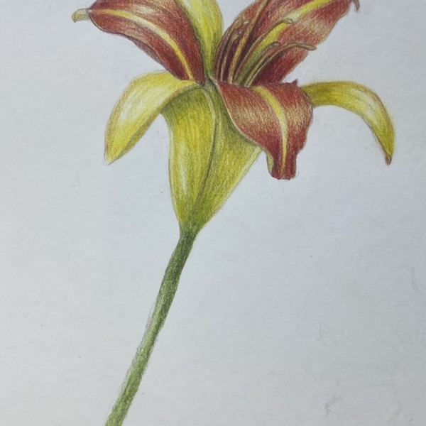
Beautiful! You are getting those nice darks! I think the maroon aspects of this drawing are working better than the yellows. You have chosen a very cool, greenish color for your yellow shadows. This can work, but be careful it doesn’t get too grey. Leave more of the yellow color or add some warm ochres. Also, I’d like to see a rounder shape in the bottom of the flower. The highlights you have on the edges are flattening it out. Think of it as a cone.
Beautiful! You are getting those nice darks! I think the maroon aspects of this drawing are working better than the yellows. You have chosen a very cool, greenish color for your yellow shadows. This can work, but be careful it doesn’t get too grey. Leave more of the yellow color or add some warm ochres. Also, I’d like to see a rounder shape in the bottom of the flower. The highlights you have on the edges are flattening it out. Think of it as a cone.
Great, thank you for all of the tips. I’m going to draw it again with all of that in mind and see what happens 🙂