Several things: 1. I love daffodils {or jonquils as my Nana called them} but I’ve never been able to draw them to my own satisfaction. This my be the first that I am genuinely happy with, despite its imperfections. 2. The line that indicates the “main” or front most petal… it is what it is… but how would I make it less prominent for drawings going forward?
Yellow flowers are so tricky Paige! I think the upper face of the curved up area on the middle petal would be lighter because it would catch the light. The lower section of the curve would be toned a little because it would not catch as much of the light and toning there would convey that it curves under there. I would tone more to the right of the curled part of the petal because that curl would cast a shadow on the petal. You could tone the bottom of the petal on the right and where the middle petal overlaps it. Remember that the tan papery part that the flower emerges from and the green area below it should also have highlights and a range of tones to enhance their form. Did the petals surrounding the center trumpet have any veining details, etc. that you could add for definition and interest?
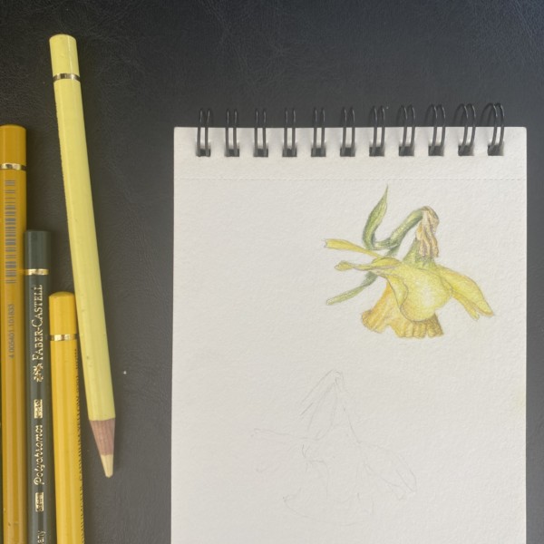