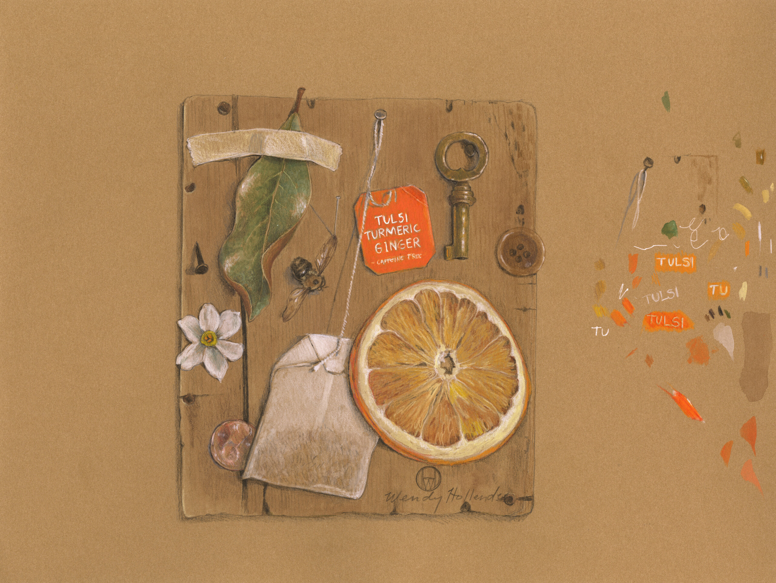
Have you ever seen a drawing so realistic that it fools you into believing it’s a three-dimensional object?
“Trompe L’oeil” is a French term meaning “Fool the Eye”.
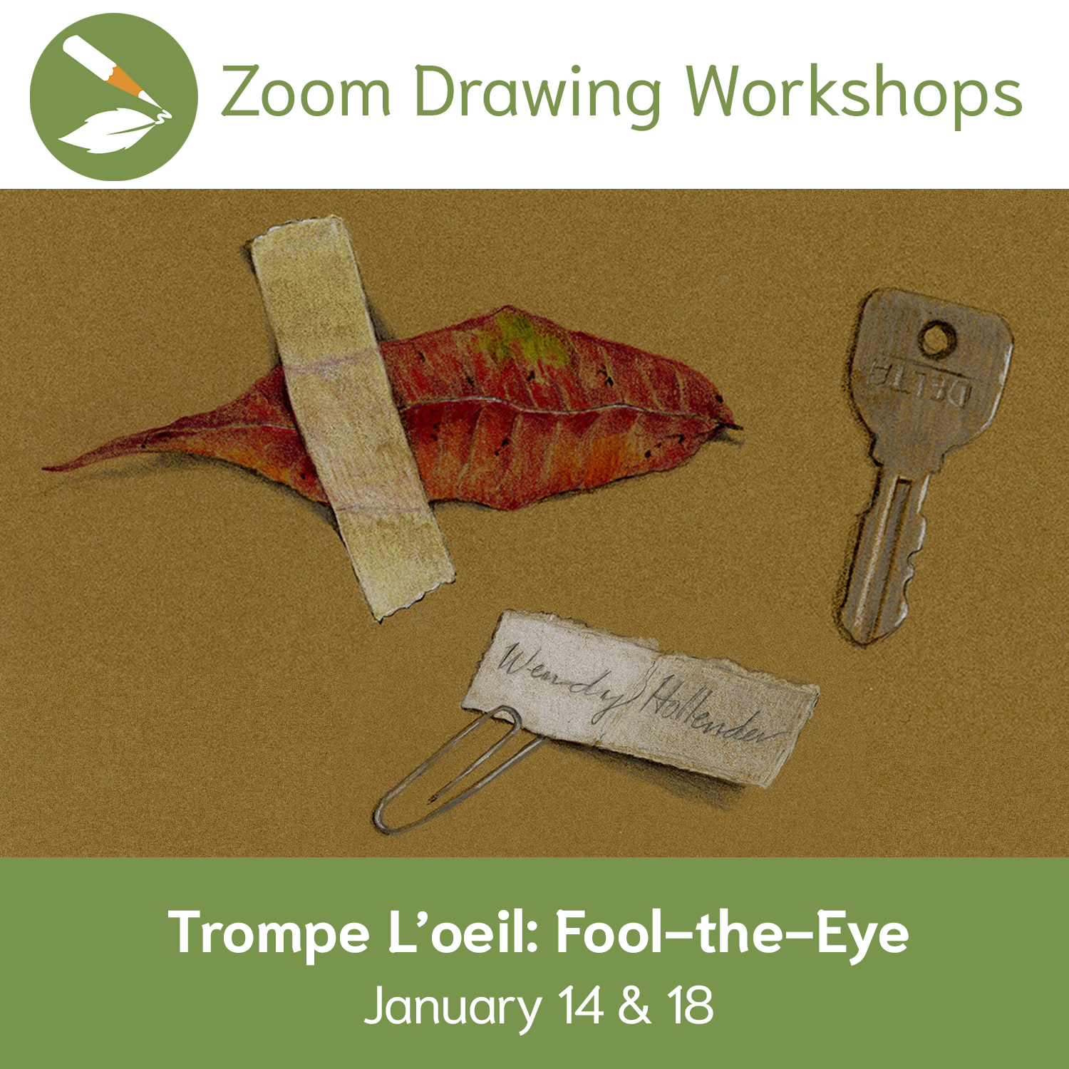
Learn (from Wendy!) how to incorporate these fun techniques on kraft paper and tell a story by choosing related or symbolic elements to draw. Lesson inspired by Gerald P. Hodge, 1999, with whom Wendy studied back in the last century. Scroll through this post for examples of student work produced during the workshop.
Find Trompe L’oeil Workshop Recording Here.
In order to fool the eye into thinking that a flat painting actually consists of real three-dimensional objects, here are
4 “tricks” for composition, color, style, & presentation
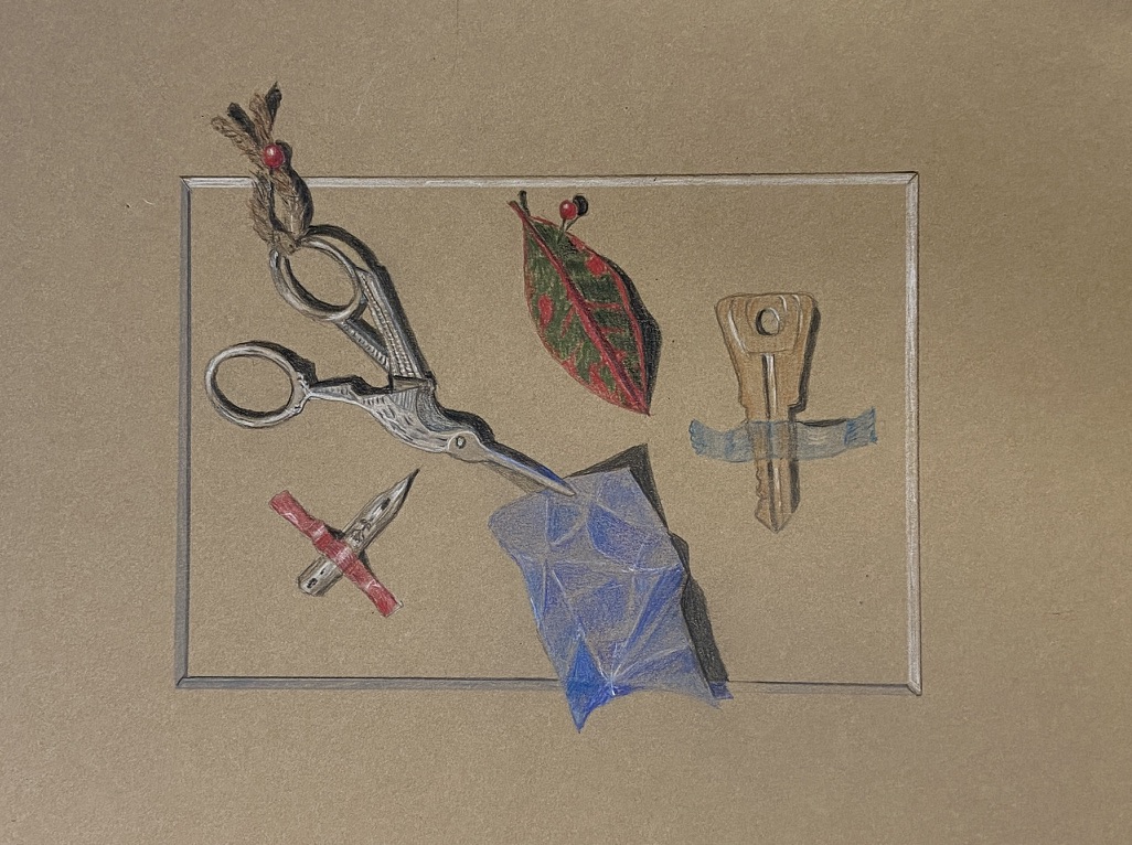
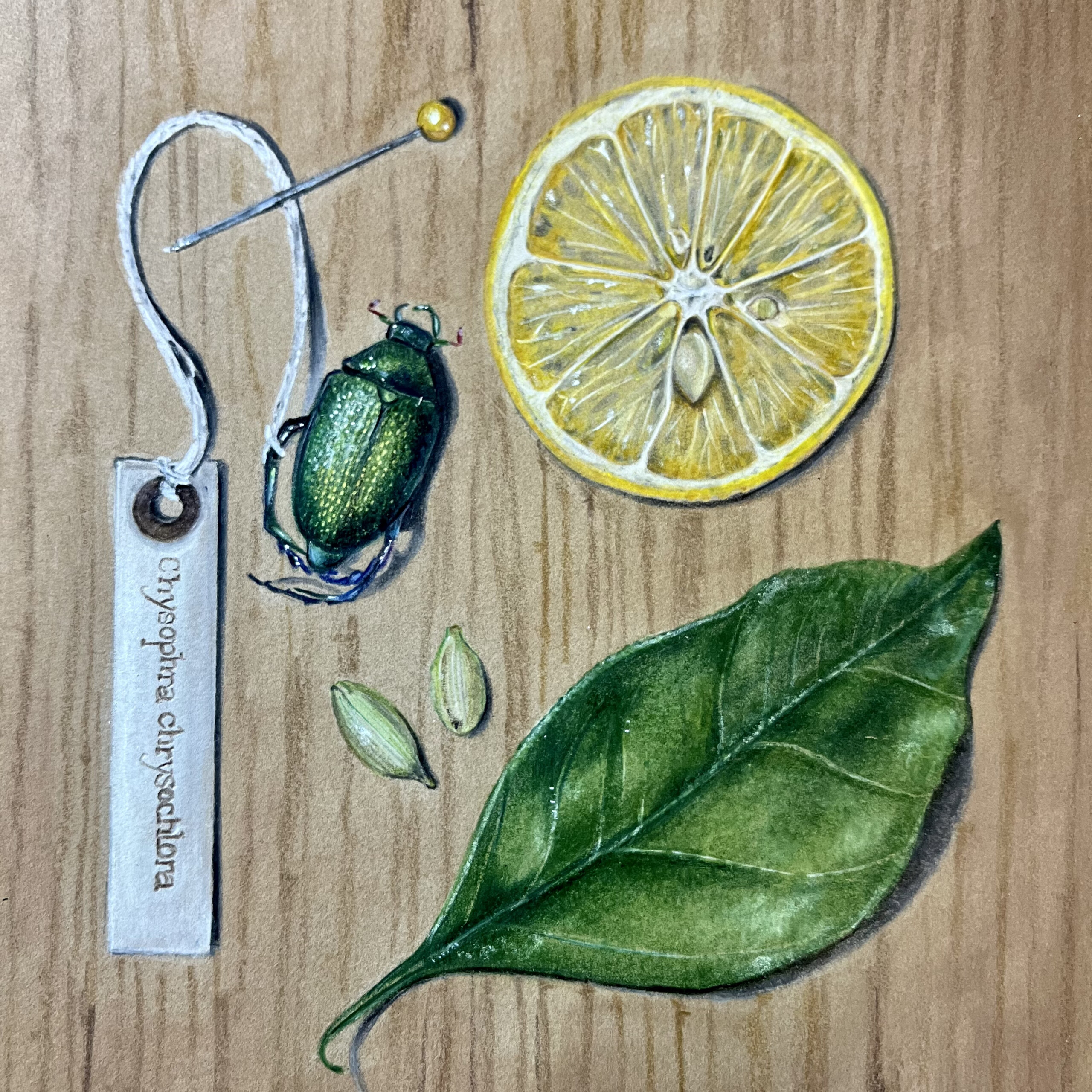
1. Subjects must be fairly flat.
For a small painting, about 10”x12”, subjects should be less than 1” in depth – preferably less. Start with simple subjects such as envelopes, stamps, coins, receipts, letters, ribbons, feathers, keys, etc.
Also try botanical subjects like flattened leaves and flowers (herbarium pages) seeds, nuts, branches, seedpods, etc.
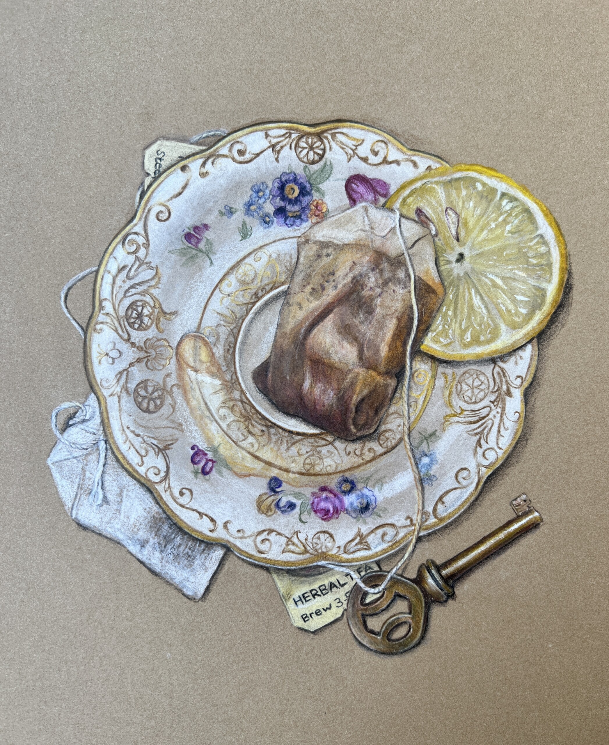
Position yourself so that your eye is directly over the center of the composition. It can be tricky to paint like this, so for convenience, you could adhere your flat subjects to a propped-up board or put on an easel so your eye has that same perspective.
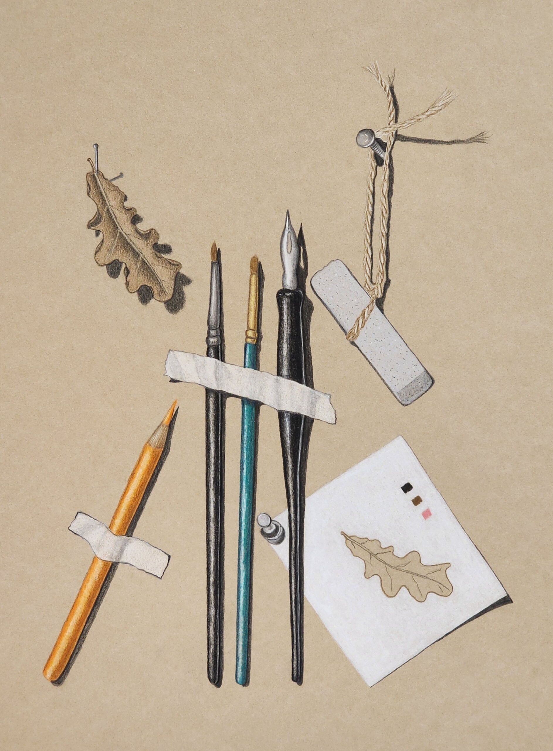
2. Shadows must be short and sharply defined.
For clarity, you’ll want one light source coming from the upper-left (45 degrees). Using more than one light source will result in the realistic illusion being lost. (Find FREE TIPS on light source here.)
Perspective and draftsmanship must be totally convincing. (Find FREE TIPS on perspective here.)
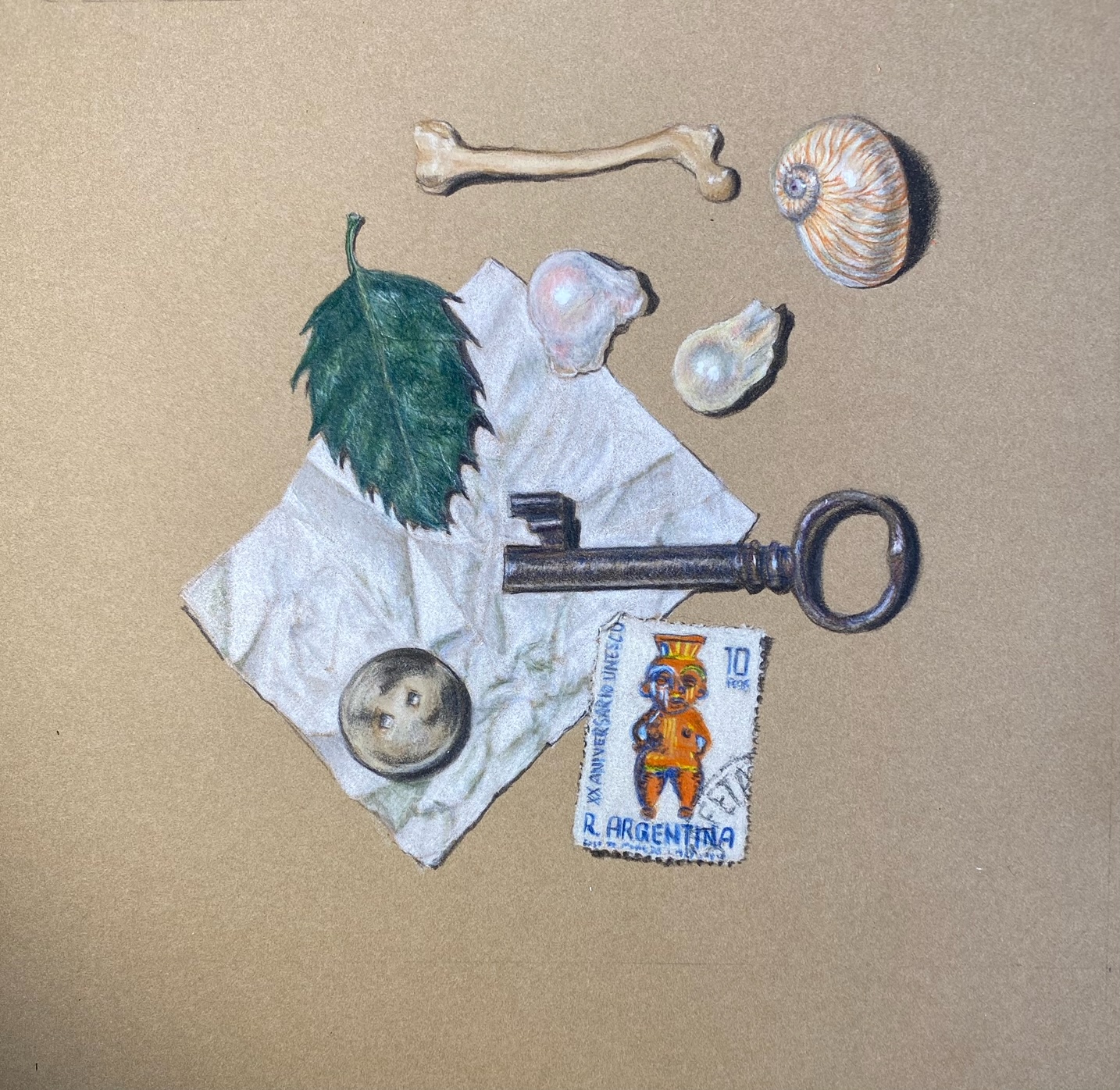
Hard edges are best. Brush strokes should be absent. Nothing should be impressionistic, abstract, or left to the imagination.
The shadows will be short and the eye will be fooled into seeing these objects as three dimensional.
3. Warm colors come forward. Cool colors recede.
Use color theory to your advantage! Consider using a cool color for the background which will recede, and a warm or hot color for a top object which will advance forward. An example is a cool, dull green background on which a bright red nasturtium has been painted.
Find FREE TIPS on color theory here.
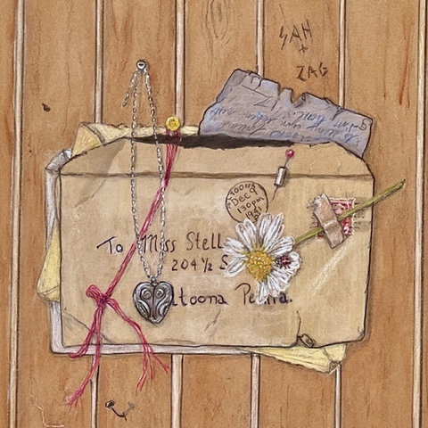
4. Unexpected background elements enhance the story.
A trompe l’oeil effect is further enhanced if a mat is included as part of the composition, and a small portion of one or more of the subjects is/are painted to overlap the mat.
Any surprise or unexpected element in the composition will add to the effect, such as a coffee stain, scuff marks, a blurred postmark on an envelope, an object which has come loose and has fallen part way under or over the mat, etc.
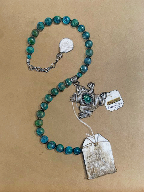
Get creative! Comb through your space for flat finds that work together to tell a story. The story can be fact or fiction, as long as you have fun.
Learn (from Wendy!) how to incorporate these fun techniques on kraft paper and tell a story by choosing related or symbolic elements to draw. Lesson inspired by Gerald P. Hodge, 1999, with whom Wendy studied back in the last century. Scroll through this post for examples of student work produced during the workshop.
Find Trompe L’oeil Workshop Recording Here.
Find more FREE DRAWINGS TIPS on our blog here!