Discover the Magic of Highlights, Shadows, and Continuous Toning
Learn How to Create the Illusion of 3D Form
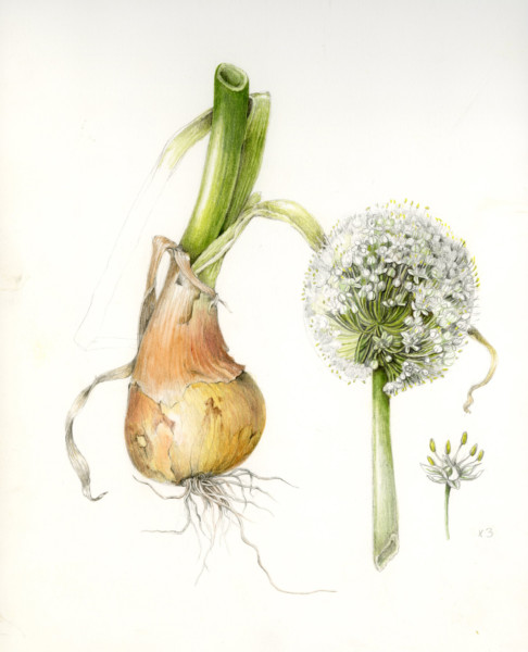
Creating a detailed, three-dimensional plant painting feels like magic to me. I stumbled through the process of uncovering the lesser-known “secrets” behind these botanical drawings. But light source shouldn’t be a mystery to solve! It’s just a visualization exercise that becomes easier and easier with practice.
Your first goal is simple: make your form look three-dimensional using ONE consistent light source.
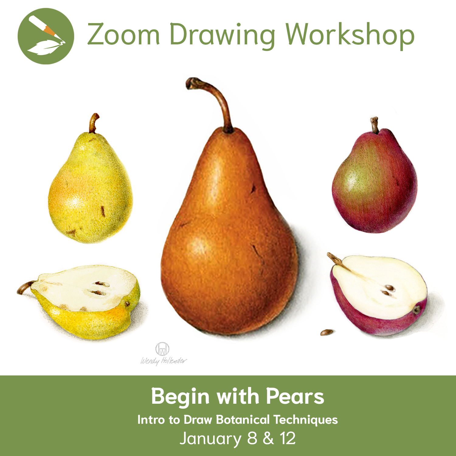
Realistic highlights and shadows provide beauty and depth to our drawings. Learn how to apply these concepts in your artwork with the recording from The Illusion of 3D Form: The Magic of Light Source, Highlights, & Shadows Zoom Drawing Workshop. If you want to learn these basic skills and more, check out the recording of our Begin with Pears: Intro to Draw Botanical Techniques Zoom Workshop.
Best Light Source Setup for Botanical Drawing and Shading
How to Position Light for Natural-Looking Drawings
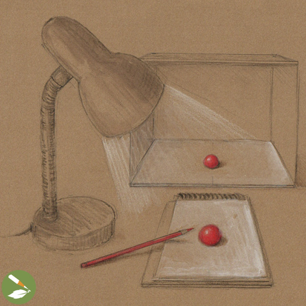
A la scientific botanical illustrations, intended for scientific accuracy, we depict our subjects with a single light source coming from the upper left. Light should hit your subject at about a 45 degree angle.
To understand how light behaves on three-dimensional forms, observe the illustration above of an ideal light-source setup. Use a box to block out other light sources in the room. Notice where shadows and highlights appear. If you include a cast shadow, it should appear on the lower right of the subject.
Note: If you are left-handed, you may want to reverse these instructions and set up your light from the upper right.
Geometry Meets Botany: A Light Source Love Story
Shading Techniques with Simple 3D Shapes
I always encourage studying a live subject and drawing what you see, but when it comes to realistic botanical illustrations, ideal light source is imperative to clearly communicate the full three-dimensionality of our subjects. If you don’t have the ideal light on your subject, don’t draw exactly what you see!
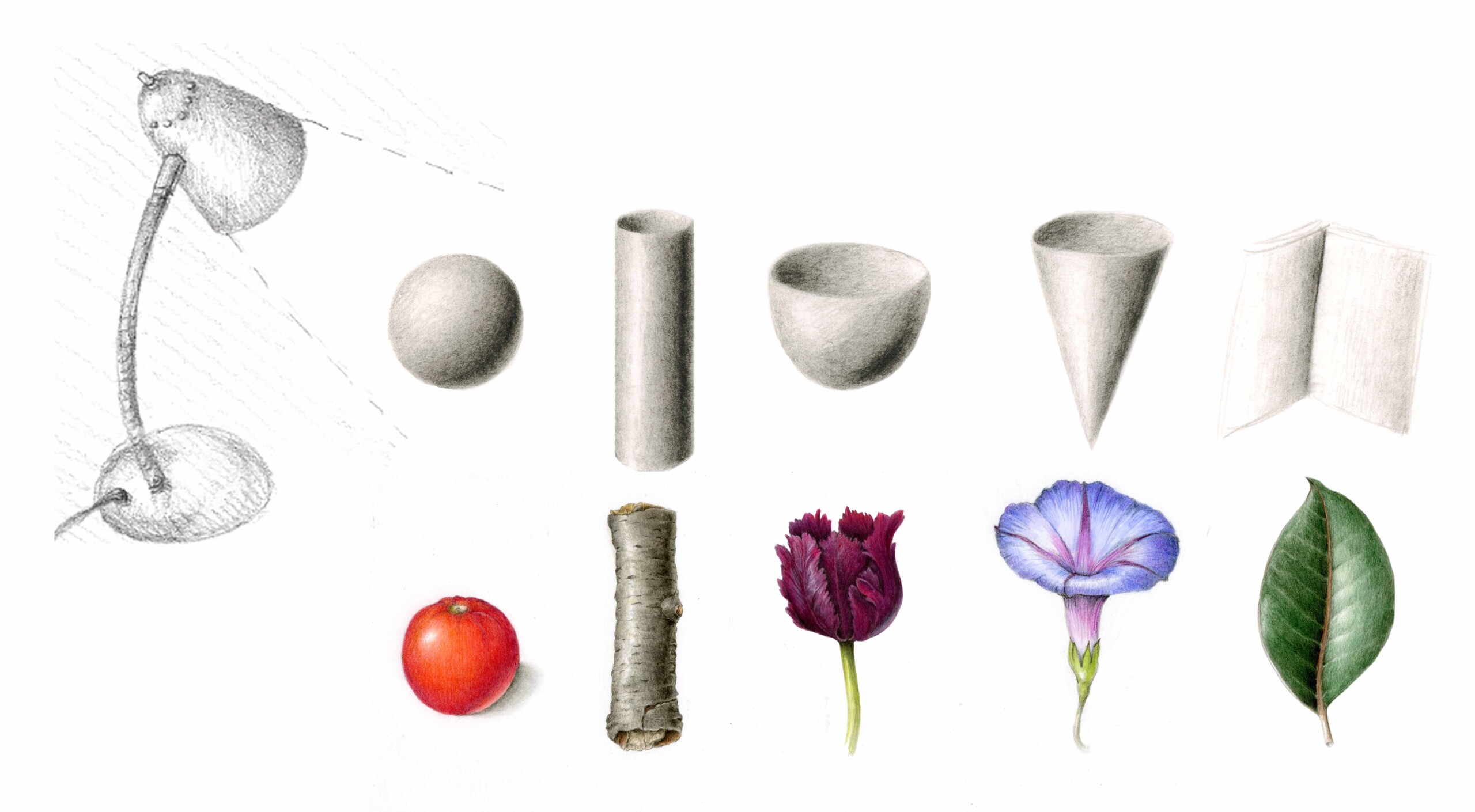
Use these basic shapes above as “light source models” for rendering botanical subjects with correct light source. Reference a cylinder for a branch or a stem, a sphere for a tomato, a cone or a cup for a flower, and two planes for a leaf.
Setting up a model and lighting it correctly can be a great reference tool. If you don’t have basic 3D shapes on hand, try using household objects such as pencils or chopsticks, etc.
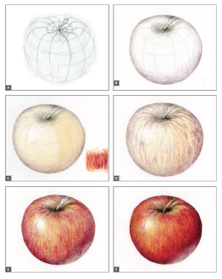
Contour & Cross-Contour: Outlines with Insight
See How Contour & Cross-Contour Lines Bring Shape and Depth to Your Art
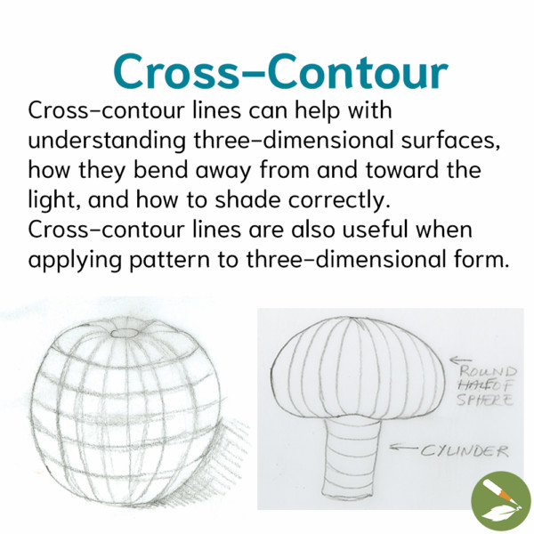
Contour lines are outlines that follow the edges or shape of a form.
Cross-contour lines can help with understanding three-dimensional surfaces, how they bend away from and toward the light, and how to shade correctly. Cross-contour lines are also useful when applying pattern to three-dimensional form.
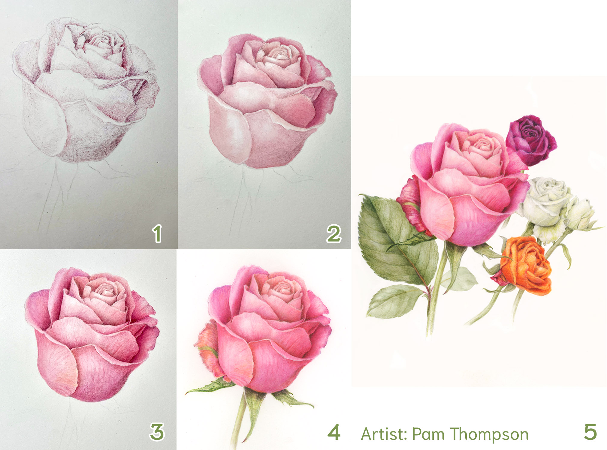
The Grisaille Toning Method: Form First, Color Second
Fifty Shades of Neutral: Don’t Be Seduced by Color
The grisaille method uses neutral toning to describe form first and color second. Once you create the form in a neutral tone using a single primary light source, add color to the tonal drawing with a layer of watercolor wash to create a solid foundation as you build layers of color and value.

Describing in a neutral tone first helps us avoid being seduced by color in the beginning and unintentionally creating flat-looking drawings.
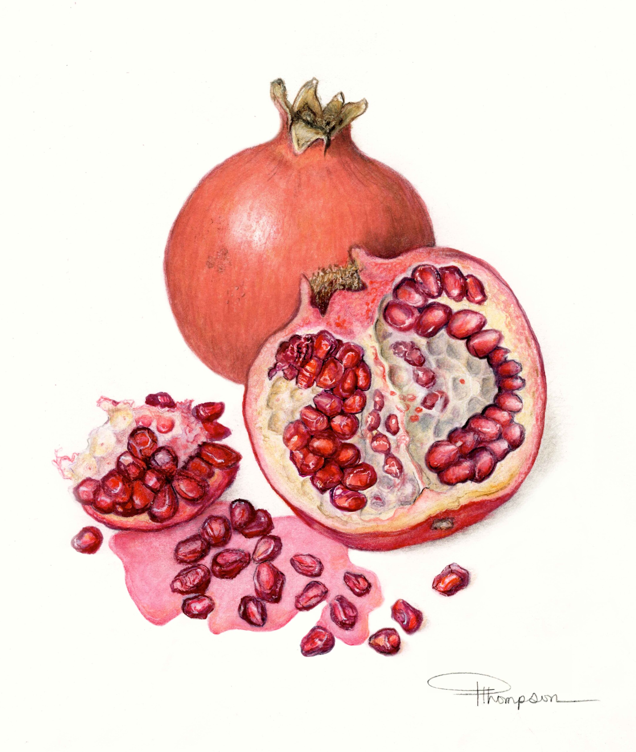
Shimmer and Shine: Bringing Botanicals to Life with Highlights
How to Add Highlights for Realistic Shading in Botanical Drawing
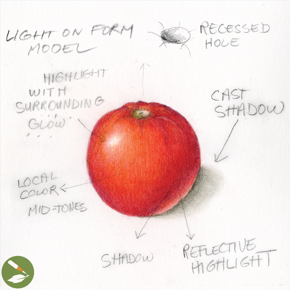
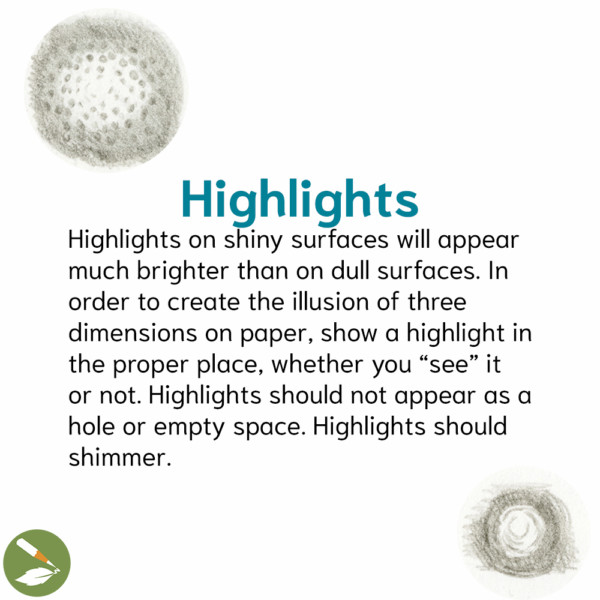
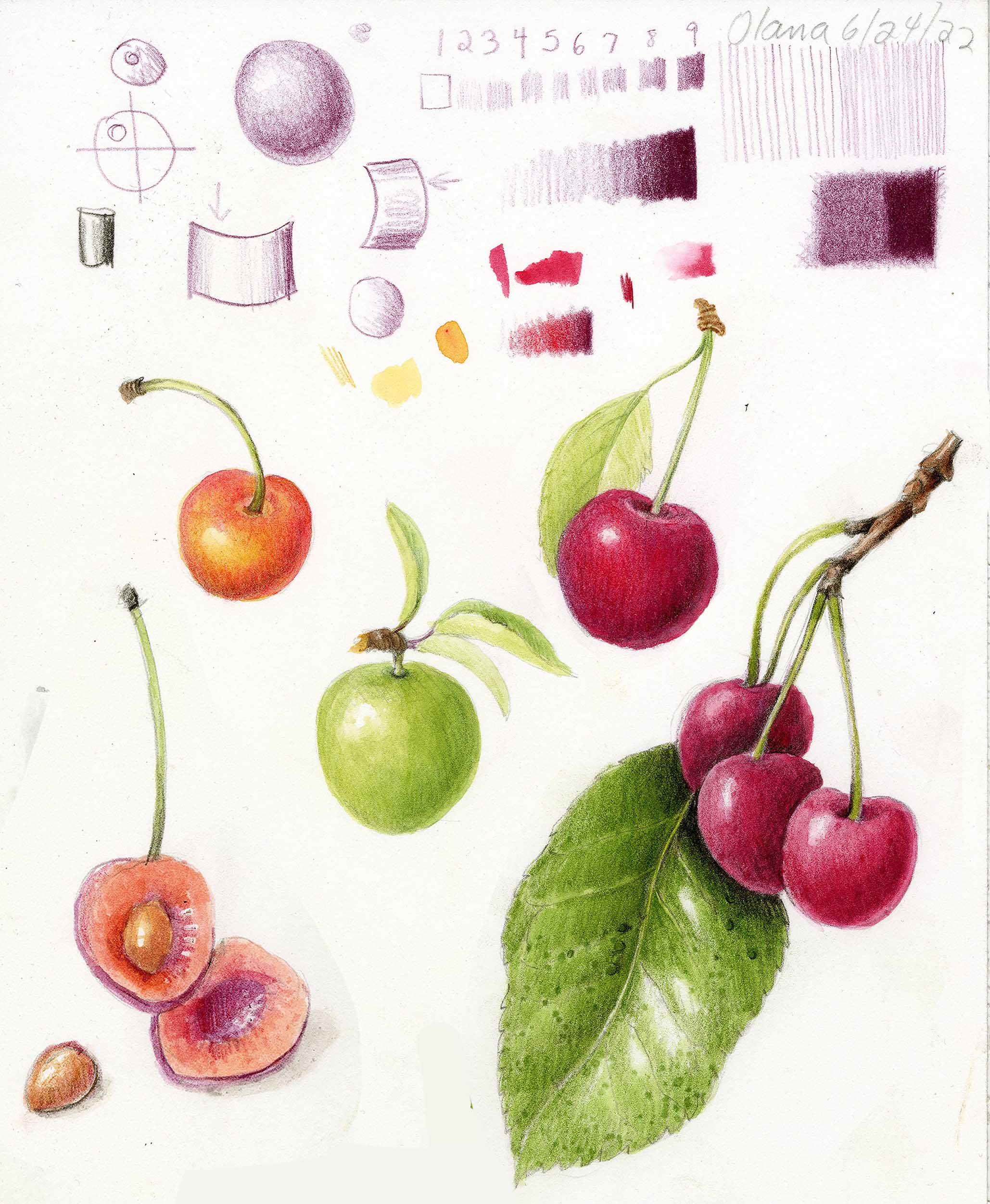
Highlights on shiny surfaces will appear much brighter than on dull surfaces. In order to create the illusion of three dimensions on paper, show a highlight in the proper place, whether you “see” it or not. Highlights should not appear as a hole or empty space. Highlights should shimmer!
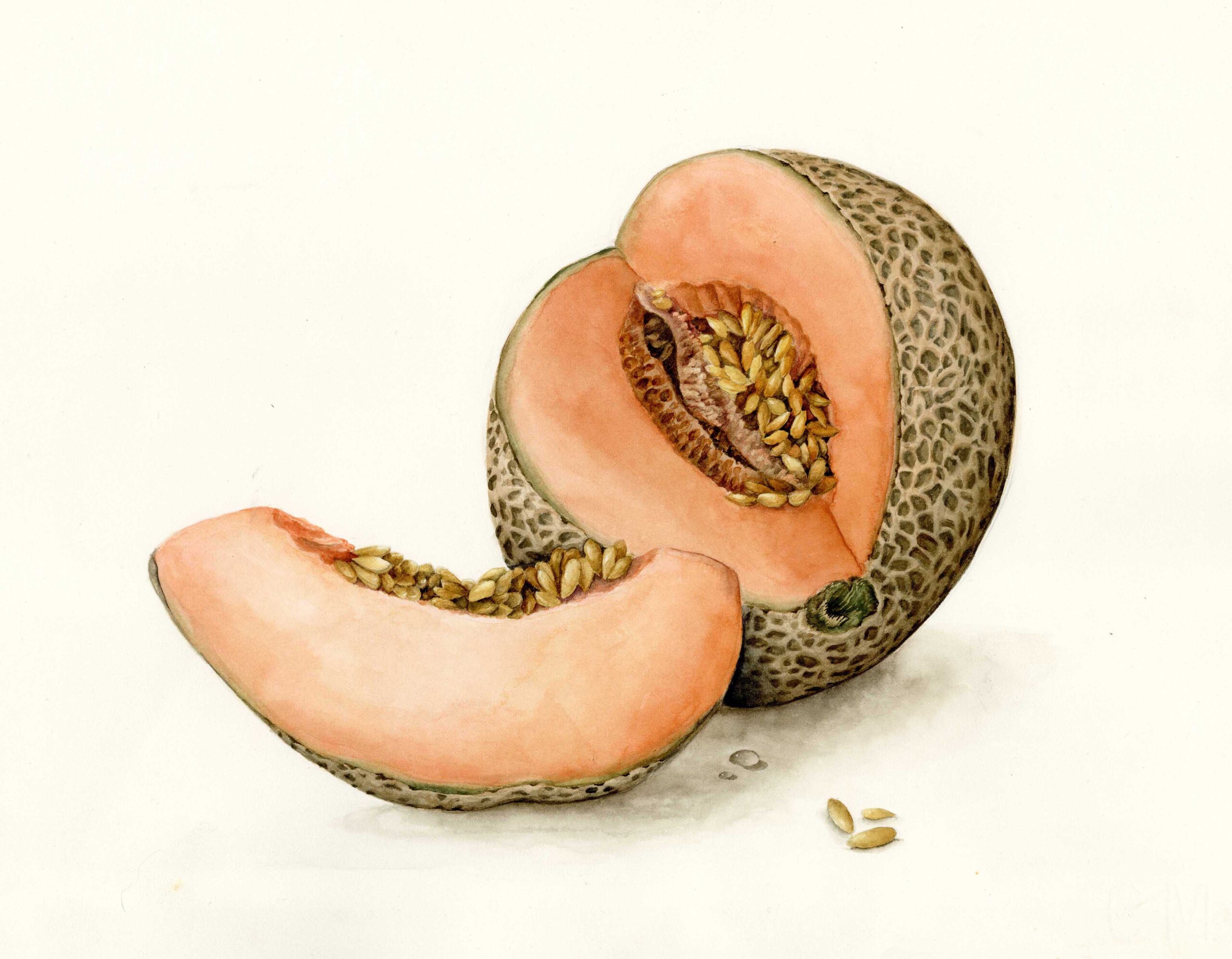
Grounded in Light: Cast Shadows Done Right
The Subtle Stagecraft of Cast Shadows
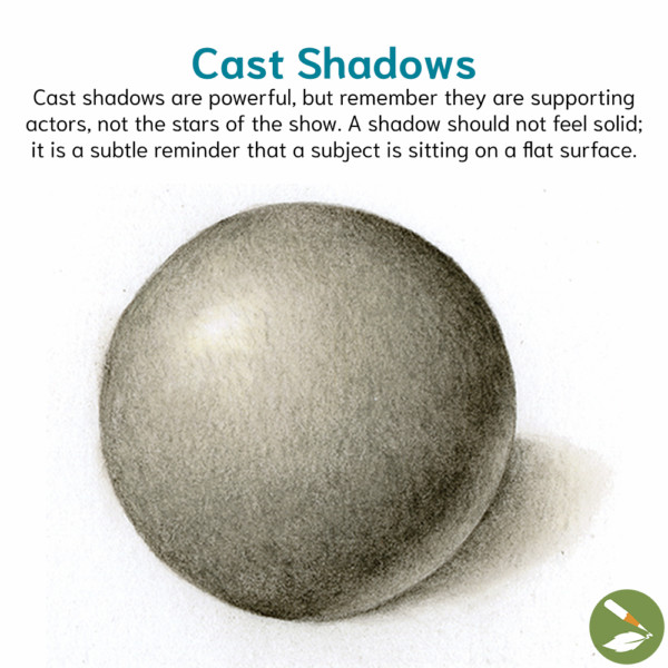
Cast shadows are powerful, but remember they are supporting actors, not the stars of the show. A cast shadow should not feel solid; it is a subtle reminder that a subject is sitting on a flat surface. Cast shadows start darkest at the base of the subject and fade lighter as they move away from the subject. They should always follow the curves of the subject to emphasize its shapes.
Note: When a cylinder crosses over a perpendicular cylinder, both sides of the bottom cylinder will not have a cast shadow. Only the side furthest from the light source would have a cast shadow.
Light Bounces Back: Playing with Reflective Light
How to Add a Subtle Glow to Your Cast Shadow
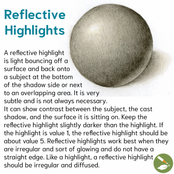
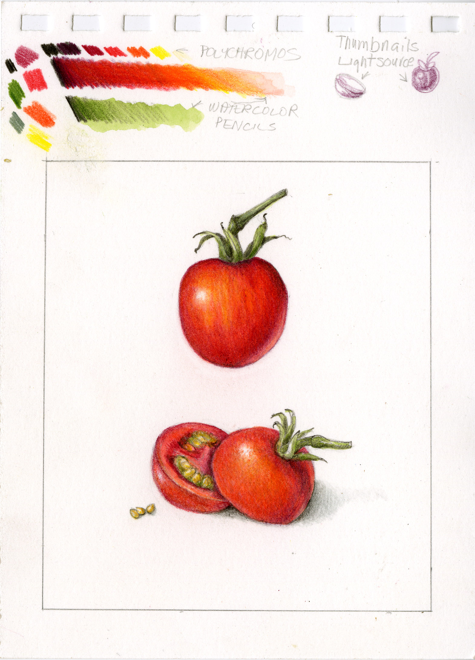
A reflective highlight is light bouncing off a surface and back onto a subject at the bottom of the shadow side or next to an overlapping area. It is very subtle and is not always necessary. It can show contrast between the subject, the cast shadow, and the surface it is sitting on.
Keep the reflective highlight slightly darker than the highlight. If the highlight is value 1, the reflective highlight should be about value 5. Reflective highlights work best when they are irregular and sort of glowing and do not have a straight edge. Like a highlight, a reflective highlight should be irregular and diffused. If your reflective highlight is too white, add a little color to tone it down.
Most importantly, your creations should come from a place of JOY. Rekindle your sense of curiosity and wonder by practicing your beginners’ mind!
Find more helpful motivation here.
Begin with Pears: Intro to Draw Botanical Techniques
Transform flat drawings into vibrant, three-dimensional wonders with a combination of whimsical watercolor and compelling colored pencil. We’ll practice with pears, the ideal subject to learn the fundamentals of our Draw Botanical techniques and study the art of depth and dimension using simple shapes and a single light source… Learn more
Want to learn more?
Try your FIRST WEEK FREE and cancel any time with no hidden fees!
