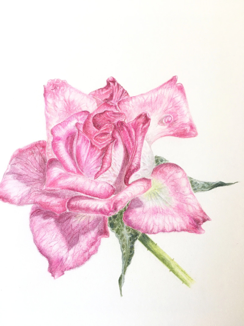
First time attempting a rose, from a photo, looking forward to a real life subject. The delicacy of roses has always scared me, less seems to be more. Having said that, I layered and layered and layered!!
Quite hard to get that sharp, defined ‘finished’ look….I burnished quite a bit, but maybe lighter colours are harder to look as if they’ve been worked into the paper?
Beautiful Amanda! The veining and details (frills and folds, etc.) are wonderful. Even though you were working from a photo there are some spots on the left side that would be in shadow and should have some dark toning. I think that will help give that finished look you mentioned. Quite often simple subjects are the hardest to capture. Nice work! Looking forward to seeing a rose drawn from life!
Thanks so much Doug! Will try to work on those shadowed spots a bit more.
12 May 2020
Amanda, agreed! This is looking great. I think another thing to look out for is the places where there is a white “halo” in between where petals meet each other. Try bringing your pigments right up next to the overlaps and use dark tones to show which is in front and which is behind. Great work here!
Thank you Vern! Yes, I am still a bit leery of losing some of the definition by leaving a slight halo, as you put it. Will have to force myself to get a bit braver and work those tones!
First time attempting a rose, from a photo, looking forward to a real life subject. The delicacy of roses has always scared me, less seems to be more. Having said that, I layered and layered and layered!!
Quite hard to get that sharp, defined ‘finished’ look….I burnished quite a bit, but maybe lighter colours are harder to look as if they’ve been worked into the paper?
Beautiful Amanda! The veining and details (frills and folds, etc.) are wonderful. Even though you were working from a photo there are some spots on the left side that would be in shadow and should have some dark toning. I think that will help give that finished look you mentioned. Quite often simple subjects are the hardest to capture. Nice work! Looking forward to seeing a rose drawn from life!
Thanks so much Doug! Will try to work on those shadowed spots a bit more.
Amanda, agreed! This is looking great. I think another thing to look out for is the places where there is a white “halo” in between where petals meet each other. Try bringing your pigments right up next to the overlaps and use dark tones to show which is in front and which is behind. Great work here!
Thank you Vern! Yes, I am still a bit leery of losing some of the definition by leaving a slight halo, as you put it. Will have to force myself to get a bit braver and work those tones!
Beautiful!
Thank you!