Looks good to me. Could the middle stem use more toning so it reads as cylindrical? Or does it look flat in your subject? I find myself wanting to see a very sharpened red-violet line on the bottom of that paper peel falling to the left. Or a brown verithin. Maybe you’re at the stage of bringing in that verithin to define and clarify a few key places. Nice work!
It looks a little flat in real life, but I agree, I think it would look better if it was a bit more cylindrical. I’ve been using the brown verithin a bit, and a graphite pencil, but perhaps I need to do more. Do you mean the front paper peel on the left or the one on the back left? Both of those look very pale in real life but I agree more definition would help. Red-violet has been useful with this drawing! Thanks Sam!
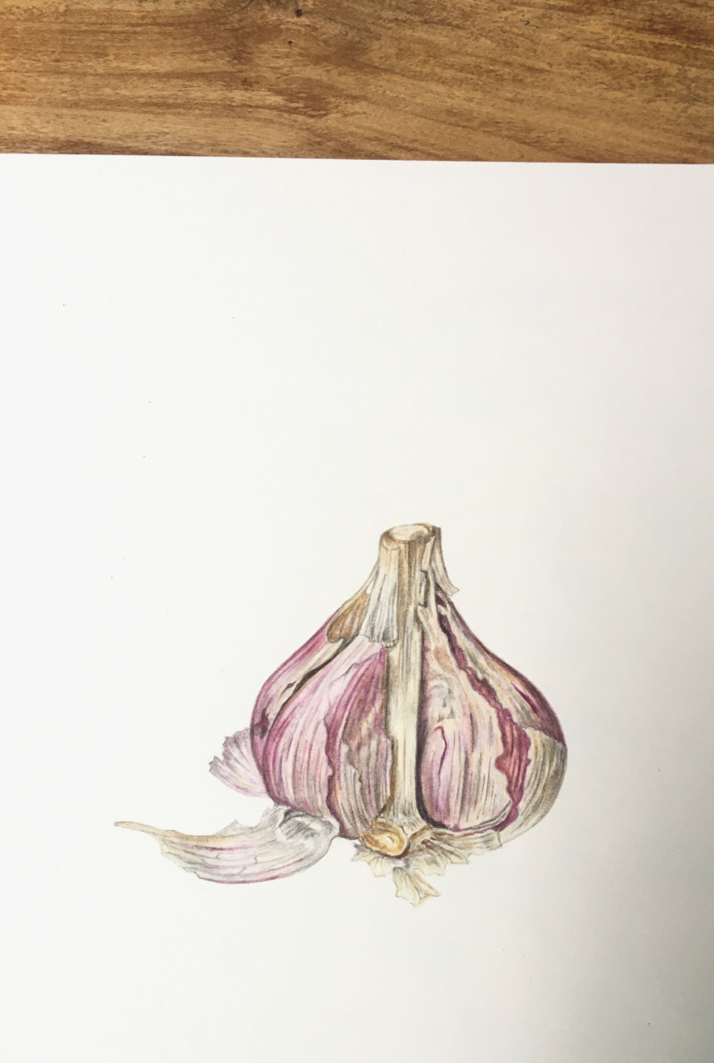
Enough darker shading on right side, or more do you think? Trying to avoid it looking ‘muddy’.
Looks good to me. Could the middle stem use more toning so it reads as cylindrical? Or does it look flat in your subject? I find myself wanting to see a very sharpened red-violet line on the bottom of that paper peel falling to the left. Or a brown verithin. Maybe you’re at the stage of bringing in that verithin to define and clarify a few key places. Nice work!
It looks a little flat in real life, but I agree, I think it would look better if it was a bit more cylindrical. I’ve been using the brown verithin a bit, and a graphite pencil, but perhaps I need to do more. Do you mean the front paper peel on the left or the one on the back left? Both of those look very pale in real life but I agree more definition would help. Red-violet has been useful with this drawing! Thanks Sam!
Love this!!