@amber Amber, awesome saturation and dark tones on this gray branch!! Your highlight reads a little like a white straight line; try to make it “shimmer” a bit, and work on the subtle transition from highlight to the #2 and #3 tones so it doesn’t feel so abrupt. GREAT darks, though. Bravo. And I like the embossed lines and toning in general where the smaller branch attaches to the larger one. The more textured branch on the right is looking good, but I recommend the same thing with the highlight there, as well as attempting that same beautiful transition into the dark tones like you have on the gray branch. The tough part will be maintaining that texture pattern while adding dark tones. Sometimes a little “back-and-forth” between light and dark can help clarify texture in darker areas. Great work!

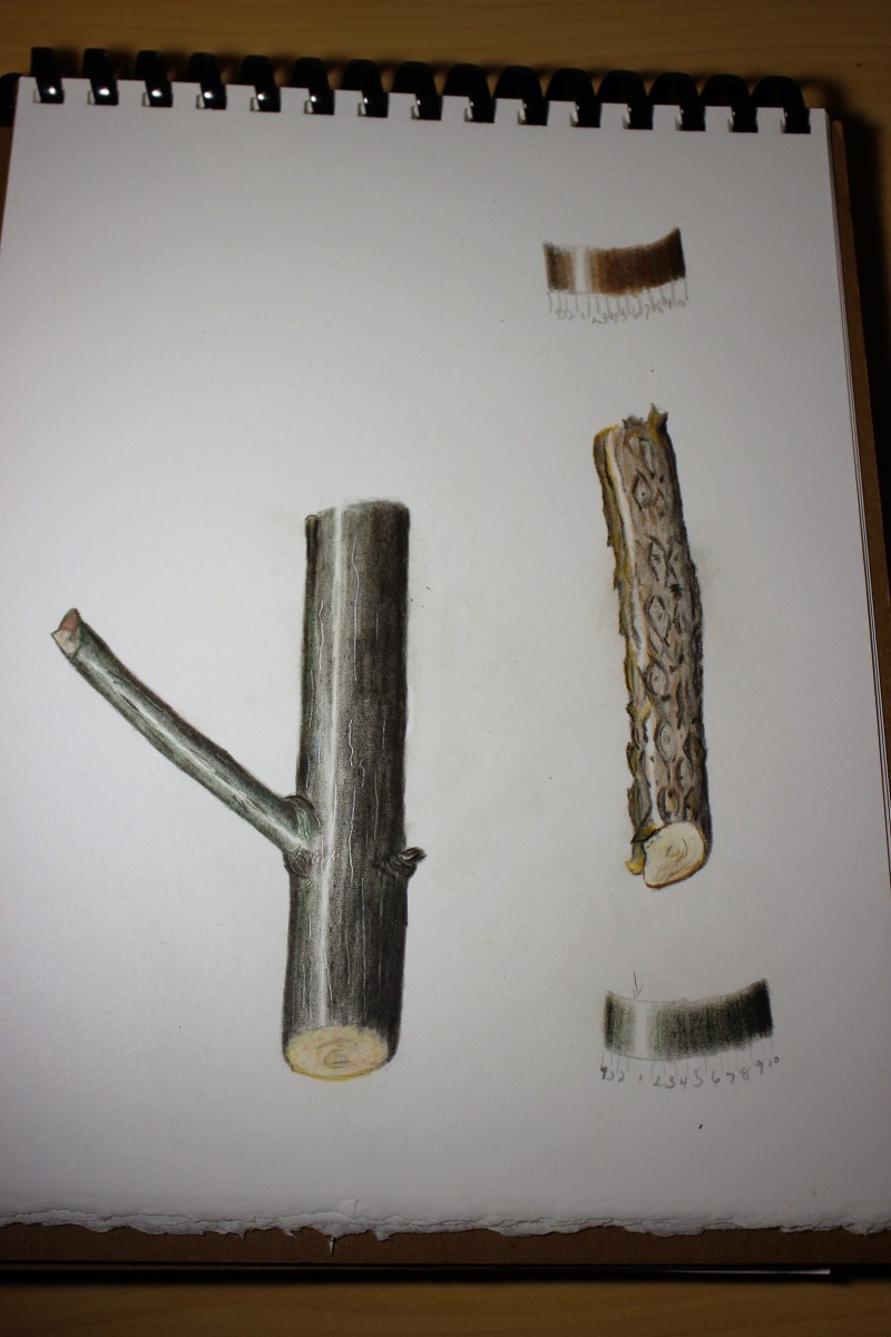
@amber Amber, awesome saturation and dark tones on this gray branch!! Your highlight reads a little like a white straight line; try to make it “shimmer” a bit, and work on the subtle transition from highlight to the #2 and #3 tones so it doesn’t feel so abrupt. GREAT darks, though. Bravo. And I like the embossed lines and toning in general where the smaller branch attaches to the larger one. The more textured branch on the right is looking good, but I recommend the same thing with the highlight there, as well as attempting that same beautiful transition into the dark tones like you have on the gray branch. The tough part will be maintaining that texture pattern while adding dark tones. Sometimes a little “back-and-forth” between light and dark can help clarify texture in darker areas. Great work!
Wendy and Vearn, thank you both for the help. I hope what I have done is an improvement still have a little more to do before posting.