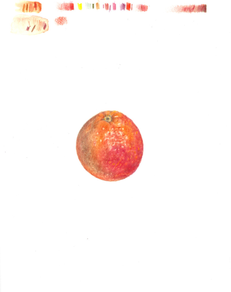
While I was finishing my previous blood orange drawing, bags of blood oranges with *variegated* outsides arrived at our supermarket. I had to get them! I will add a cut half and sections to this in the next week or so.
Thanks very much Sheila. For me, grappling with highlights has been the biggest learning experience of drawing citrus for the first time from a botanical perspective.
Thank you Pam – that is a very nice thing to say! I have always been fascinated with texture and it has gotten me into trouble – a lot of muddy, overworked pieces in my past.
Looking at this after being away fromit for a few days, I think I’d say that the shadow could use some darkening. I got a little overwhelmed trying to work the shadow, the orange, and the red, together in a way that felt unified, and after a while had to step back. I worried that the shadow was going to turn into heavy mud.
20 January 2020
Amy, have you tried another grisaille color like Red Violet or Earth Green? Those might be less harsh than the Dark Sepia on the shadow side.
I hadn’t thought of Red Violet as a grisaille color – would love to try that. I started out with Earth Green, but as the other colors became more intense I thought that Sepia would stand out better – but I didn’t push it because it started to look “dirty” to me.
The comments on the webinar were a big help, and I have now added more Red Violet and Earth Green on top of the shadow. I think this is an improvement, but I will reassess after adding other elements to the composition.
While I was finishing my previous blood orange drawing, bags of blood oranges with *variegated* outsides arrived at our supermarket. I had to get them! I will add a cut half and sections to this in the next week or so.
Fantastic texture and sparkling highlights!
Thanks very much Sheila. For me, grappling with highlights has been the biggest learning experience of drawing citrus for the first time from a botanical perspective.
Wow. You are the texture queen!
Thank you Pam – that is a very nice thing to say! I have always been fascinated with texture and it has gotten me into trouble – a lot of muddy, overworked pieces in my past.
Looking at this after being away fromit for a few days, I think I’d say that the shadow could use some darkening. I got a little overwhelmed trying to work the shadow, the orange, and the red, together in a way that felt unified, and after a while had to step back. I worried that the shadow was going to turn into heavy mud.
Amy, have you tried another grisaille color like Red Violet or Earth Green? Those might be less harsh than the Dark Sepia on the shadow side.
I hadn’t thought of Red Violet as a grisaille color – would love to try that. I started out with Earth Green, but as the other colors became more intense I thought that Sepia would stand out better – but I didn’t push it because it started to look “dirty” to me.
I won’t be able to join in live for the webinar today, but I’m looking forward to watching the playback later.