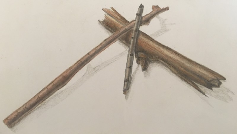
It looks really good Vanessa! Maybe analyzing the tones and seeing if you can increase the contrast, a few dark darks and light lights will make it pop. The shadows are nice a light, too, maybe just smoothing them out a little? I always have trouble keeping my shadows from being too dark. In fact, I have trouble with everything getting too dark!
Hi Vanessa, I think just a few very dark accents with a sharp pencil can give you a bit more contrast where needed and also less of a feeling of an outline on the edge of the branches. The edge of a branch can be dark but it needs to start to gradually get lighter quickly so it doesn’t feel like an outline, but an edge.
It looks really good Vanessa! Maybe analyzing the tones and seeing if you can increase the contrast, a few dark darks and light lights will make it pop. The shadows are nice a light, too, maybe just smoothing them out a little? I always have trouble keeping my shadows from being too dark. In fact, I have trouble with everything getting too dark!
I like the variety of twigs you picked out!
Hi Vanessa, I think just a few very dark accents with a sharp pencil can give you a bit more contrast where needed and also less of a feeling of an outline on the edge of the branches. The edge of a branch can be dark but it needs to start to gradually get lighter quickly so it doesn’t feel like an outline, but an edge.
Nice job, Vanessa. I get a real feeling of things being stacked on top of each other.