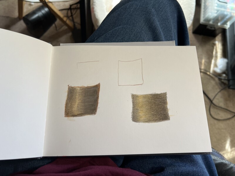
Welcome to the ArtFeed Ann! You are off to a good start with these toned cylinders. The placement of the highlight is good, especially on the cylinder on the left. The highlight should be the color of the paper, so yours could be lighter. The areas flanking the highlight should also be lighter and then transition darker as they move away from the highlight. It will only get to a 3-4 tone to the left of the highlight because it is closest to the light source, but on the right, it will transition all the way to a 9 on the right edge. Many of the tones you currently have are too similar. Doing the lesson where you do the squares of tones is good to practice before advancing to toning a cylinder. Looking forward to seeing more of your work!
Welcome to the ArtFeed Ann! You are off to a good start with these toned cylinders. The placement of the highlight is good, especially on the cylinder on the left. The highlight should be the color of the paper, so yours could be lighter. The areas flanking the highlight should also be lighter and then transition darker as they move away from the highlight. It will only get to a 3-4 tone to the left of the highlight because it is closest to the light source, but on the right, it will transition all the way to a 9 on the right edge. Many of the tones you currently have are too similar. Doing the lesson where you do the squares of tones is good to practice before advancing to toning a cylinder. Looking forward to seeing more of your work!
Thank you for the help!!
Thank you for your suggestions!!!