This is beautiful Becky! Working from photographs does have it’s challenges too, because the photographic images often do not show the highlights and shadows you need so your drawn image will have form. For instance, the petals on the right are furthest from your light source so they should be toned darker. Right now they are as light as other areas of the tulip that would be receiving more light. You also have to make sure that you are lighting live subject matter correctly, but it is easier to control. I think you will find that there is nothing like working from live plant material!
Thank you Doug. I do realize that it’s best to paint/draw from real life, however, between running a business and having two children, finding enough time becomes a challenge for me. During Covid, I started doing watercolor tutorials, however, I soon realized that I was just following along and not really learning, hence my shift to Draw Botanical. I am trying hard to focus on toning and highlights!!!
These vibrant saturated colors are just gorgeous! Your drawing is very nice and you captured the texture of those petals beautifully. I would just echo what Doug suggested. You can go back in there, while imagining the light is coming from the upper left, and add in some darker toning on the right side and bottom of the flower, and in the deepest pockets where the petals overlap – this should help give it more of a 3D feel. You can add in the darker values slowly and lightly. This drawing is so beautiful as it is, but I think you will learn a lot about creating 3 D form, if you try adding in some darker form with imaginary light. Can’t wait to see more from you!!!
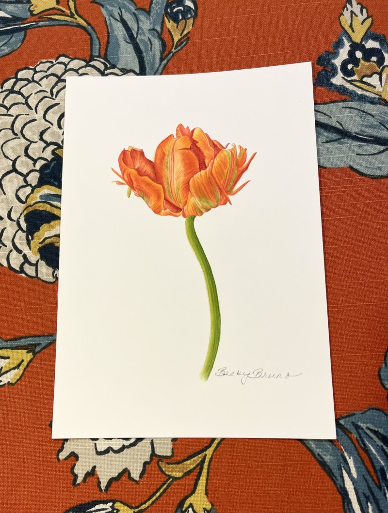
Tulip, primarily watercolor, painted with permission from the photographer. Still working on the highlights.
This is beautiful Becky! Working from photographs does have it’s challenges too, because the photographic images often do not show the highlights and shadows you need so your drawn image will have form. For instance, the petals on the right are furthest from your light source so they should be toned darker. Right now they are as light as other areas of the tulip that would be receiving more light. You also have to make sure that you are lighting live subject matter correctly, but it is easier to control. I think you will find that there is nothing like working from live plant material!
Thank you Doug. I do realize that it’s best to paint/draw from real life, however, between running a business and having two children, finding enough time becomes a challenge for me. During Covid, I started doing watercolor tutorials, however, I soon realized that I was just following along and not really learning, hence my shift to Draw Botanical. I am trying hard to focus on toning and highlights!!!
These vibrant saturated colors are just gorgeous! Your drawing is very nice and you captured the texture of those petals beautifully. I would just echo what Doug suggested. You can go back in there, while imagining the light is coming from the upper left, and add in some darker toning on the right side and bottom of the flower, and in the deepest pockets where the petals overlap – this should help give it more of a 3D feel. You can add in the darker values slowly and lightly. This drawing is so beautiful as it is, but I think you will learn a lot about creating 3 D form, if you try adding in some darker form with imaginary light. Can’t wait to see more from you!!!