Becky, You did a great job. Those colors are gorgeous. And your shadow colors are really nice. There’s something funky going on the bottom of the pear toward the right side. Do you have a photo of the pear from this point of view? Maybe we could help that area a bit if we could see what that looks like. But, I’m guessing that what is making it look a little funky there is the dark outline that I’m seeing on the bottom, and where there is what may be an indentation or crack in the bottom. I think if you could lift some of that line with a kneaded eraser and then carefully feather your shadow colors into the form, that area may look a bit more natural. The only other thing that I’m seeing is that the core shadow that is on the right side of your pear is about the same value as the very left side of the pear. You could lighten up that shadow on the left side a bit. But these are nit picky suggestions. It’s a great drawing .Good work.
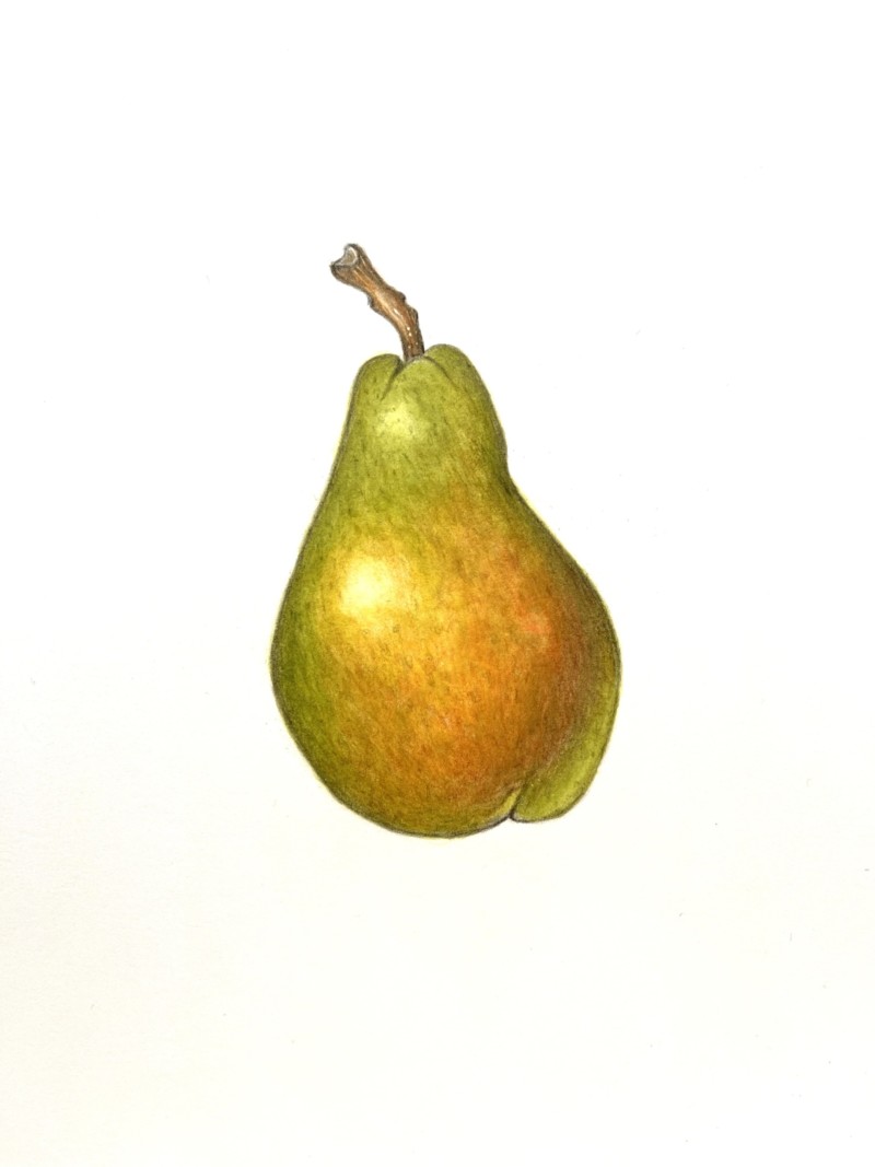
I really struggled with this one! Feedback is greatly appreciated! Thank you.
Becky, You did a great job. Those colors are gorgeous. And your shadow colors are really nice. There’s something funky going on the bottom of the pear toward the right side. Do you have a photo of the pear from this point of view? Maybe we could help that area a bit if we could see what that looks like. But, I’m guessing that what is making it look a little funky there is the dark outline that I’m seeing on the bottom, and where there is what may be an indentation or crack in the bottom. I think if you could lift some of that line with a kneaded eraser and then carefully feather your shadow colors into the form, that area may look a bit more natural. The only other thing that I’m seeing is that the core shadow that is on the right side of your pear is about the same value as the very left side of the pear. You could lighten up that shadow on the left side a bit. But these are nit picky suggestions. It’s a great drawing .Good work.