The second half of my Drawing Branches video assignments. A welcome challenge and learning experience for me to start to pay close attention to and incorporate shadows.
Really lovely drawing. I can tell you really paid attention to the cast shadows. They are nicely drawn, with skilled variation in light. Sometimes cast shadows can become too important in a drawing, but I think they work really well here. A lovely drawing.
Thanks very much for the nice feedback. I’ve been wondering if the shadow for the larger branch is too narrow to be believable, but I was afraid to overwork it.
Beautiful work!! Love the personality in each of these branches, Great work with the texture and shreddy bits at the edges. And, I agree, I think you did a good job with these shadows; my only thought is that they might read a little clearer if they were slightly lighter or grayer throughout… the extra dark areas near the tips of the branches get a little confusing for me, in that they start to compete with the branches themselves. Just a little tip for next time. This drawing looks great!
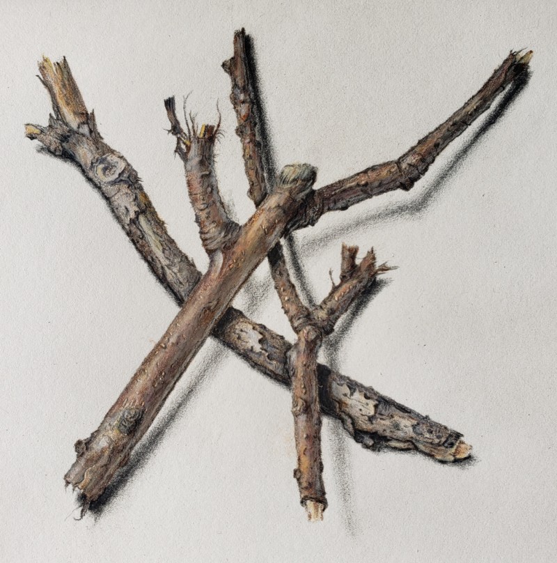
The second half of my Drawing Branches video assignments. A welcome challenge and learning experience for me to start to pay close attention to and incorporate shadows.
Really lovely drawing. I can tell you really paid attention to the cast shadows. They are nicely drawn, with skilled variation in light. Sometimes cast shadows can become too important in a drawing, but I think they work really well here. A lovely drawing.
Thanks very much for the nice feedback. I’ve been wondering if the shadow for the larger branch is too narrow to be believable, but I was afraid to overwork it.
I think the narrowness of the shadow helps the illusion of the branch being closer to the viewer than the paper on which it lies. I think it works.
Thank you!
Beautiful work!! Love the personality in each of these branches, Great work with the texture and shreddy bits at the edges. And, I agree, I think you did a good job with these shadows; my only thought is that they might read a little clearer if they were slightly lighter or grayer throughout… the extra dark areas near the tips of the branches get a little confusing for me, in that they start to compete with the branches themselves. Just a little tip for next time. This drawing looks great!
Thanks for the help!