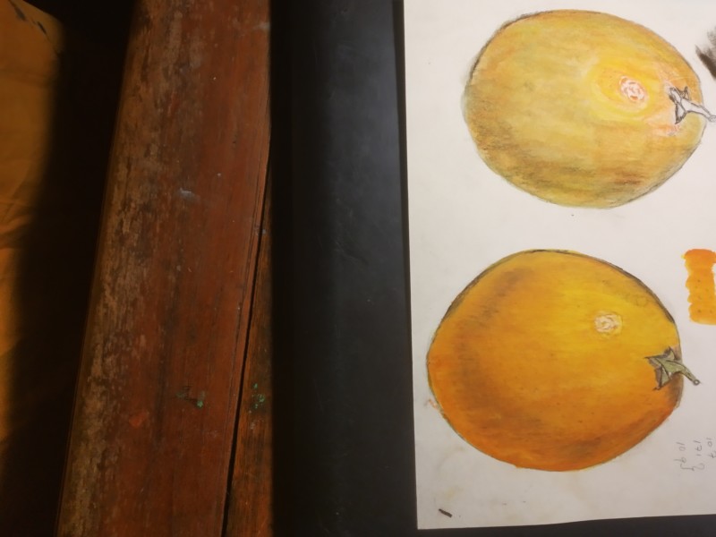
The orange is looking good Bill. The left edge is closest to your light source so it should not be so dark. The right side conversely could be darker. Be careful not to lose the reflected highlight, which may be a little wide, but it looks good how it blends in! With and orange color you could use the red/violet for the dark toning instead of dark sepia. The highlight on a textured surface is tricky. Areas surrounding the highlight could be lighter. Nice job!
The orange is looking good Bill. The left edge is closest to your light source so it should not be so dark. The right side conversely could be darker. Be careful not to lose the reflected highlight, which may be a little wide, but it looks good how it blends in! With and orange color you could use the red/violet for the dark toning instead of dark sepia. The highlight on a textured surface is tricky. Areas surrounding the highlight could be lighter. Nice job!