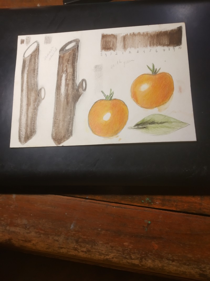
On your arc tone bar, the highlight should be the color of the paper and the #2 flanking it should just be slightly darker. The area to the left of the highlight, which is closest to the highlight should only get up to a 3 or 4, not 5. I currently don’t see much difference in the tones in that section of your tone bar. Starting off with a good grisailles layer of toning is important for a successful drawing.
On your arc tone bar, the highlight should be the color of the paper and the #2 flanking it should just be slightly darker. The area to the left of the highlight, which is closest to the highlight should only get up to a 3 or 4, not 5. I currently don’t see much difference in the tones in that section of your tone bar. Starting off with a good grisailles layer of toning is important for a successful drawing.