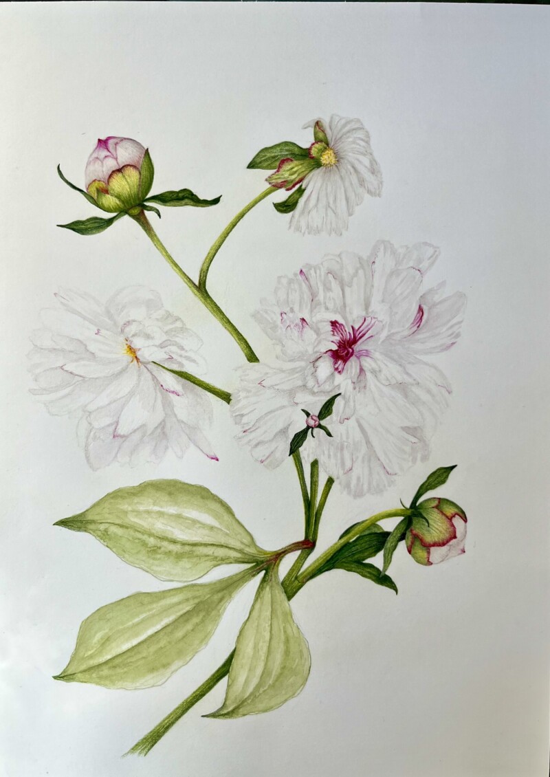
This is my second attempt at capturing peonies – it’s not finished yet – have to do the colored pencil detail on the leaves and more detailed shading on the flowers which I find very challenging. Any suggestions? Should I add green leaves behind the main white flower to set them ff the white? I am afraid of getting a dirty look if I shade too heavily but maybe I’m using the wrong grey. I did a watercolor shading first and just started going into to define the leaves more with grey. Suggestions welcome!
Hi Margaret- you are off to a great start! The colors are beautiful and the stems and buds are looking wonderful. I understand your concern about the petals getting muddy, but you need more shading to give the flower dimension and form. Right now most of the petals appear very flat. Leave the highlight areas as white as possible and I would use faber-castell’s warm gray pencil to build up layers of tone to emphasize the curve of the petals and the shadows. Also remember that there will be a light side of the overall flower closest to the light source and a darker side furthest from the light source. Thinking of the peony flower as a sphere, as they usually are, will help guide you as to how it should be toned for form. Adding leaves behind the flowers will set the white flowers off more, but I really like the composition now and I would urge you not to add too many leaves if you decide to go that route. I don’t think you need to add leaves if you can create more contrast by working on the toning.
This was very helpful, Doug. I ended up using the deep fuchsia pink sporadically on the petals which worked great and also deepened the contrasts. I’ll post the final drawing.