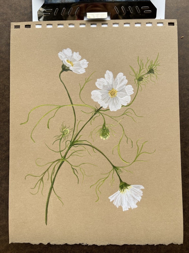
Beautiful composition Margaret and it looks great on the Kraft paper! I am missing the toning that is going to give the flowers depth and dimension. Right now all areas of the flowers look the same. Giving some toning to the areas that are in shadow, etc would help remedy that.
Gorgeous movement in this composition, Margaret. I would echo what Doug suggested. I would add in some tiny really dark bit’s in some of those little triangles where the petals meet, in order to add some more contrast and to get that dark value in there. I would especially add those really dark bits to the focal point flower that is looking right at us, to give the focal point the highest amount of contrast. This is looking fantastic, Margaret.