Carol, lovely saturated colors and texture on the acorn caps! I have two suggestions for you: 1. Work these leaf veins just a bit more so that they get thinner as they reach the edge of the leaf, and make them so thin that they disappear before they reach the leaf edge. You can still totally work that into this drawing. 2. The highlight on the acorn is looking much better with regard to placement. I would just make it a little less like a “stripe” here. You can feather into it just a little bit more and muss it a bit so that it shimmers; break up that clear line so that it looks less like a shape. And maybe add a highlight on the other acorn? You’re doing some awesome work here.
This is wonderful.
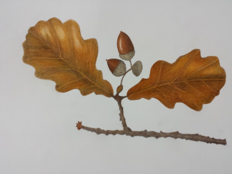
Carol, lovely saturated colors and texture on the acorn caps! I have two suggestions for you: 1. Work these leaf veins just a bit more so that they get thinner as they reach the edge of the leaf, and make them so thin that they disappear before they reach the leaf edge. You can still totally work that into this drawing. 2. The highlight on the acorn is looking much better with regard to placement. I would just make it a little less like a “stripe” here. You can feather into it just a little bit more and muss it a bit so that it shimmers; break up that clear line so that it looks less like a shape. And maybe add a highlight on the other acorn? You’re doing some awesome work here.