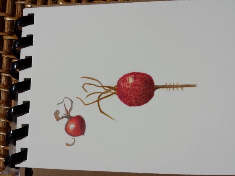
Carol, I love rosehips! So beautiful, and such a fun, round form. The color in these is beautiful. What strikes me immediately, though, is that it seems like these 2 rosehips have a different light source? I recommend keeping that upper-left light source consistent, especially for elements on the same page. I am curious about the crackly surface on the larger one; how did you achieve that effect? It’s really interesting. Nice toning on the smaller one; you got good dark tones to contrast the highlight, and it looks very nice and round. Good job!
Carol, I love rosehips! So beautiful, and such a fun, round form. The color in these is beautiful. What strikes me immediately, though, is that it seems like these 2 rosehips have a different light source? I recommend keeping that upper-left light source consistent, especially for elements on the same page. I am curious about the crackly surface on the larger one; how did you achieve that effect? It’s really interesting. Nice toning on the smaller one; you got good dark tones to contrast the highlight, and it looks very nice and round. Good job!
The texture on the larger rose hip is lovely. You rendered it very well. I also like the stems and thorn-like shapes.
I really like these. So suggestive…