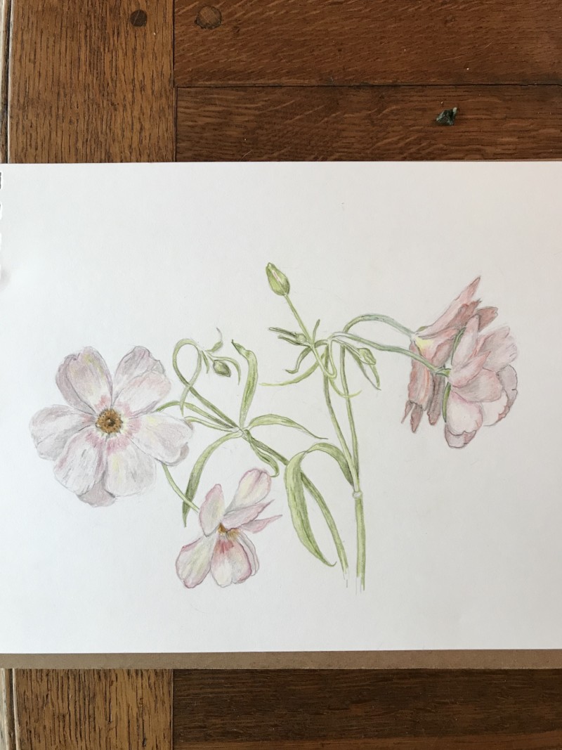
Butterfly Ranunculus. Love the curvy stems and leaves. Also translucent petals that are iridescent when strong light shines on them. This is apparently due to a ‘waxy ‘ coating and is very attractive to the eye of the pollinator. Challenges: how do I make that shiny white reflectiveness of iridescence?? Apply white watercolour?? I really don’t like the two flowers at the left. In order to make the one behind recede it had to be darkened. But then I felt it became a miry mess. Is there a solution?? Or should I have just left the one behind out?? Is this just a problem with very pale / nearly white flowers??
29 April 2018
Carol, white flowers are certainly difficult. To make them look 3-dimensional, it can be tough to choose which neutral to use so that the result is not too cool or too warm to mix with the other inherent colors in your specimen. I think you have done a nice job here, and I think that by adding more dark tones into other parts of your drawing, you can “quiet” the neutrals that feel too dark to you right now. What I think you’ll find is that if you darken and saturate the stems and leaves a bit more, and then add teeeeeny, very dark (black verithin?) touches where overlaps are the darkest in the petals, this drawing will pop right off the page, and what seems dark to you now will feel like a nice mid-tone. It is looking great.
Great advice Vern, helps me a lot. The drawing is really nice Carol and Vern’s advice should help you get the drawing to where you can be satisfied with it.

Butterfly Ranunculus. Love the curvy stems and leaves. Also translucent petals that are iridescent when strong light shines on them. This is apparently due to a ‘waxy ‘ coating and is very attractive to the eye of the pollinator. Challenges: how do I make that shiny white reflectiveness of iridescence?? Apply white watercolour?? I really don’t like the two flowers at the left. In order to make the one behind recede it had to be darkened. But then I felt it became a miry mess. Is there a solution?? Or should I have just left the one behind out?? Is this just a problem with very pale / nearly white flowers??
Carol, white flowers are certainly difficult. To make them look 3-dimensional, it can be tough to choose which neutral to use so that the result is not too cool or too warm to mix with the other inherent colors in your specimen. I think you have done a nice job here, and I think that by adding more dark tones into other parts of your drawing, you can “quiet” the neutrals that feel too dark to you right now. What I think you’ll find is that if you darken and saturate the stems and leaves a bit more, and then add teeeeeny, very dark (black verithin?) touches where overlaps are the darkest in the petals, this drawing will pop right off the page, and what seems dark to you now will feel like a nice mid-tone. It is looking great.
Great advice Vern, helps me a lot. The drawing is really nice Carol and Vern’s advice should help you get the drawing to where you can be satisfied with it.