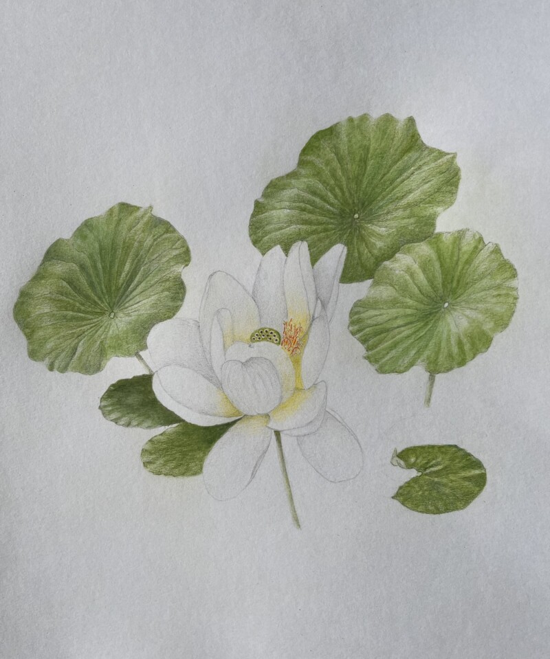
Hi Doug, I would like to get your advice on how to make the lotus flower come off the page. I see that darkening the leaves would help. I am thinking that adding a few leaves i.e. more small flat leaves that sit on the water and/or adding a wash of dark indigo water colour though I don’t have much practice with water colour wash. What do you think?
Hi Helene- another wonderful drawing! I agree with you that the addition of a small, flat leaf would help. Especially on the right side of the flower where there is a lot of negative space between the flower and the large leaves on the right side. I also agree with you about darkening the leaves. The large leaves are gorgeous, but there are a lot of highlights. I would consider trying a few things. I would darken the well areas in addition to toning down and maybe even eliminating some of the highlights. As you know having a strong contrast between the flower and the leaves is what is going to make the flower (and entire image) pop the most. I don’t know if a blue wash will create enough contrast. It would have to be fairly dark as a lighter blue would be too similar tonally.