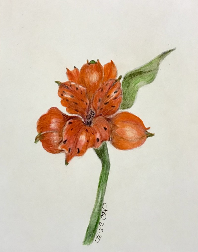
Hi Cathie- great strong, rich colors! I am having a hard time figuring which direction your light is coming from. The highlights seemed to be centered on each petal and the stem and leaf don’t have a fully formed highlight or range of tones. It is important to establish that base so that the illustration of the subject is as realistic as possible. I would also add some dark toning where the petals overlap and any shadows that would exist (in the center well, etc). Establishing where your light is coming from will answer all those questions! Look at the negative space on either side of the flower where the top petals meet the bottom petals. On the right, I would enlarge the leaf to fill some of the negative space and on the left I would change the shape of a petal or two. It is okay to fudge some things for the good of the whole!
Hi Cathie- great strong, rich colors! I am having a hard time figuring which direction your light is coming from. The highlights seemed to be centered on each petal and the stem and leaf don’t have a fully formed highlight or range of tones. It is important to establish that base so that the illustration of the subject is as realistic as possible. I would also add some dark toning where the petals overlap and any shadows that would exist (in the center well, etc). Establishing where your light is coming from will answer all those questions! Look at the negative space on either side of the flower where the top petals meet the bottom petals. On the right, I would enlarge the leaf to fill some of the negative space and on the left I would change the shape of a petal or two. It is okay to fudge some things for the good of the whole!