Hi Clotilde, I agree, it’s a bit too dark. Also pay a bit more attention the the width and shape. If you narrow it and lighten it, especially as it moves away from the leaf, I think it will work. I think it is an informative element. I like that it indicates that the leaf stem curls away from the table. Overall, these leaves look great! Some of the comments I had with your other leaf have been addressed here. A more defined midrib, pillowing and highlights on the veins. Good job!
These look great, Clotilde. Way to notice your own needs for bringing the shadow into balance with the drawing. Your drawing here has such a lovely quality. Puts me in mind of many drawers/illustrators/painters whose work I love looking at – even a touch of Maurice Sendak in here for me.
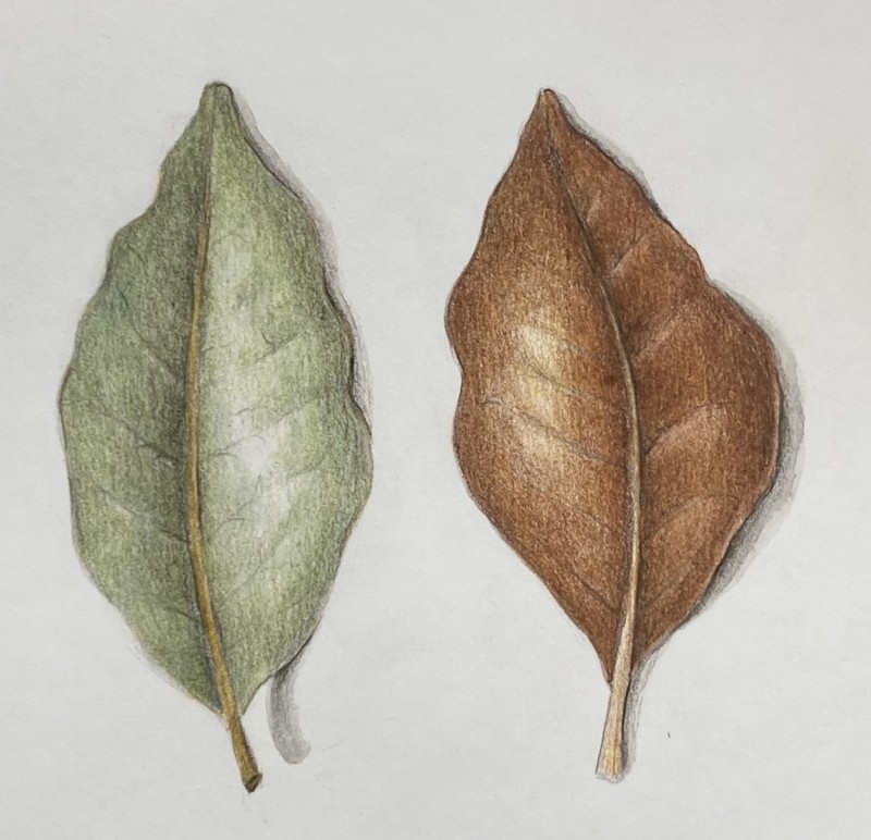
I think the cast shadow of the stem on the green side of the leaf is too dark
Hi Clotilde, I agree, it’s a bit too dark. Also pay a bit more attention the the width and shape. If you narrow it and lighten it, especially as it moves away from the leaf, I think it will work. I think it is an informative element. I like that it indicates that the leaf stem curls away from the table. Overall, these leaves look great! Some of the comments I had with your other leaf have been addressed here. A more defined midrib, pillowing and highlights on the veins. Good job!
Thanks Katy!
These look great, Clotilde. Way to notice your own needs for bringing the shadow into balance with the drawing. Your drawing here has such a lovely quality. Puts me in mind of many drawers/illustrators/painters whose work I love looking at – even a touch of Maurice Sendak in here for me.
What a kind compliment Sam, thank you.