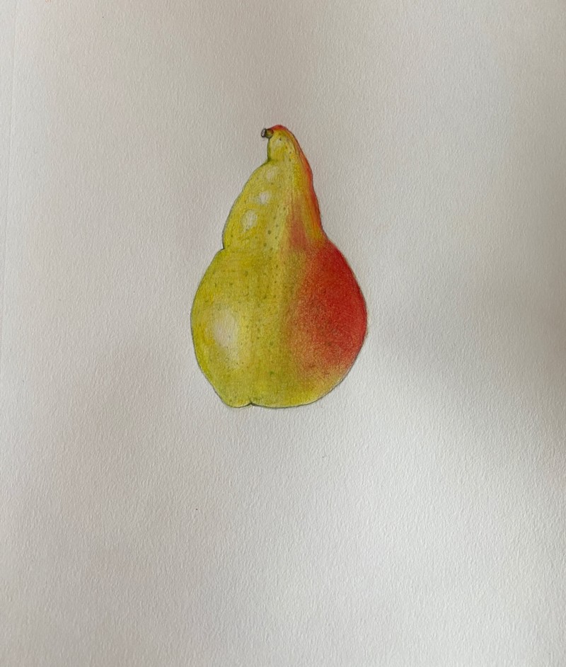
This drawing is so pleasing to look at! But for botanical illustration it seems a bit expressive. The colors just a little too bright. And I want to see you tone a bit more to get a better spherical shape. It seem a bit flat. Look for where you could add that core shadow. That could tone down the color a bit. And incorporate the highlights into the contours of the pear a bit more. Texture is great!
This drawing is so pleasing to look at! But for botanical illustration it seems a bit expressive. The colors just a little too bright. And I want to see you tone a bit more to get a better spherical shape. It seem a bit flat. Look for where you could add that core shadow. That could tone down the color a bit. And incorporate the highlights into the contours of the pear a bit more. Texture is great!