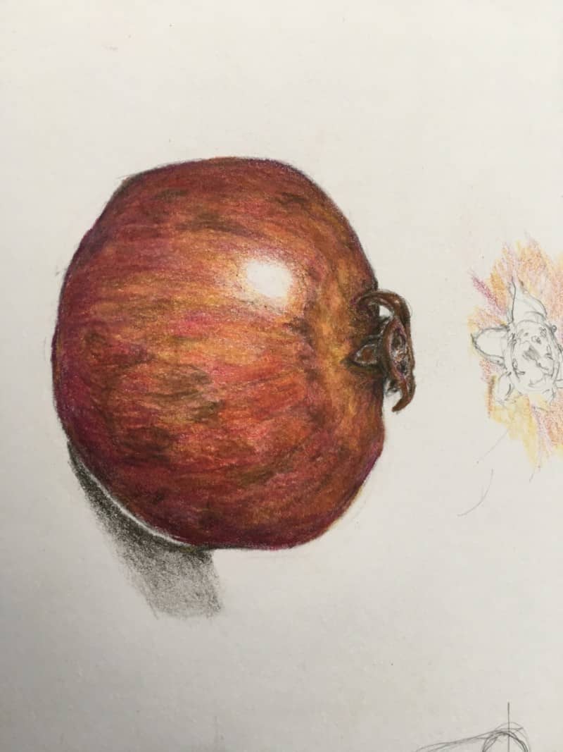
What a lovely, shiny pomegranate! I really enjoy your color blending and patterning here. I think you could quiet that highlight just a little bit by getting some more mid and light tones surrounding it, and make it feel irregular and shimmery. I LOVE the sepals and flower remnants at the top. Great rolling and detail there. I think you could work a little more on the cast shadow and reflective highlight here. The reflective highlight feels like an empty white space here. You want the reflective highlight to feel like part of the fruit, not part of the shadow, and not like white space. So, give the reflective highlight a little tone to match the fruit and fade it into the shadow side of the fruit. The reflective highlight should feel like a glow. It also should not be the same value as the highlight. Try to tone it down to about a 5. The cast shadow has nice graduation from darkest next to the fruit into lighter as it fades into the paper, but I think overall it could be a little lighter. Try using Gray Verithin or Gray pencil rather than Dark Sepia at first, so the shadow stays quiet and ghostly. Hope that helps. Your work is looking really good lately.
What a lovely, shiny pomegranate! I really enjoy your color blending and patterning here. I think you could quiet that highlight just a little bit by getting some more mid and light tones surrounding it, and make it feel irregular and shimmery. I LOVE the sepals and flower remnants at the top. Great rolling and detail there. I think you could work a little more on the cast shadow and reflective highlight here. The reflective highlight feels like an empty white space here. You want the reflective highlight to feel like part of the fruit, not part of the shadow, and not like white space. So, give the reflective highlight a little tone to match the fruit and fade it into the shadow side of the fruit. The reflective highlight should feel like a glow. It also should not be the same value as the highlight. Try to tone it down to about a 5. The cast shadow has nice graduation from darkest next to the fruit into lighter as it fades into the paper, but I think overall it could be a little lighter. Try using Gray Verithin or Gray pencil rather than Dark Sepia at first, so the shadow stays quiet and ghostly. Hope that helps. Your work is looking really good lately.