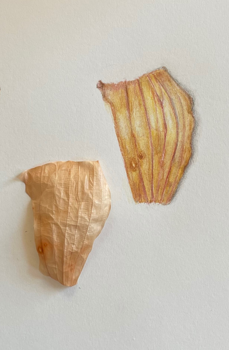
Hi Constance, You have chosen an interesting and challenging subject. I applaud your choice! The comments I will make are based on the actual onion skin you have provided and the angle I am seeing it from. In seems the drawing is a bit off. Note and compare the curves of the top and bottom. Also, the lighting appears to come from the upper right in the photo of the subject. In your drawing, it seems to come from the upper left. I also think the under color is a bit too yellow. What I do like about your drawing is the organic quality of the ribs. The weight varies interestingly. They darken as they go into the shadows and lighten in the highlights. Nice observation!
Hi Katy, Thanks so much for your comments on my drawing. I always learn so much from the thoughtful comments of the instructors here. I debated whether to include the original onion skin because it had dried up so much by the time I finished my drawing (I worked on it over a couple of days.) When I read your comments on color, I went back to what was left of the onion in the fridge. The color was much more vibrant than the dried skin here. But still, my drawing is too bright yellow. I had tried toning it down with ivory, but that didn’t work. Do you have suggestions for what I should have done? Should I have used a complementary color on it? The lighting is different from the photo because I tried to use the lighting direction that Wendy always uses in the videos. I am glad it looks like the light comes from the left as in her drawings! Thanks for the notes about the rib weight, too, because I really tried to do just what you noticed. Thanks for taking so much time to give me such good feedback.
Hi Constance, Yellow is a challenge. For a light hue, it is very powerful and hard to erase. A complimentary color is a good choice to tone down the intensity. The problem is getting too dark. A cool and very light brownish color would be good. A cool tan or even a warm, light grey. As for the lighting, My congratulations! changing the light source is a good exercise, since sometimes you need to enhance or even create a light source. In your drawing the highlights work pretty well, but the shadows on the right side could be more pronounced to better indicate the curve.