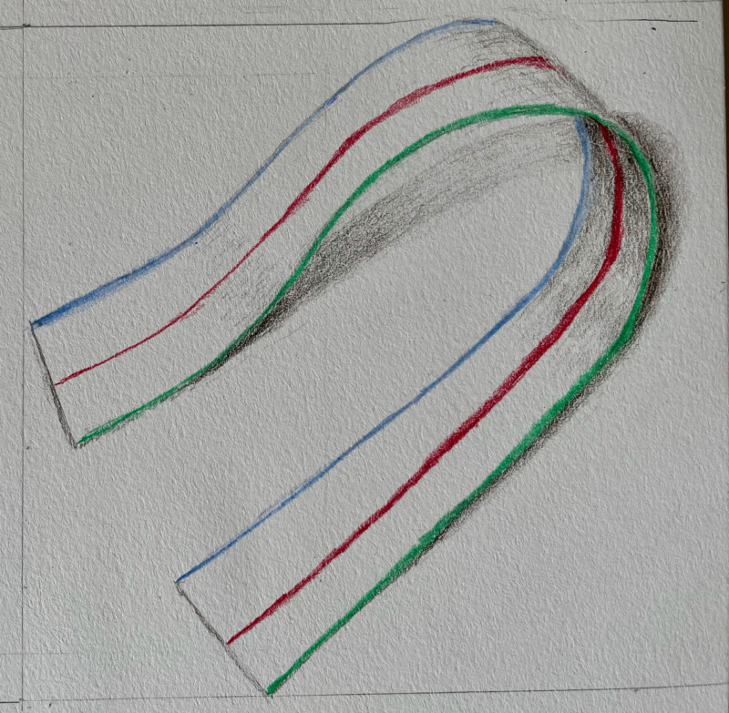
I’ve set up a simple box for these lessons to exclude other light sources except for the light set up to the left at about 45 degrees as shown in one of the earliest lessons for BB. It’s never been a great setup and it really showed on this lesson. The shadows produced by my set up are really dark and with a sharp edge, so I never get gradations to a lighter shadow. I’ve been imagining what it should look like. Does anyone have a resource to point me toward for a simple box and light set up that works well for these lessons?
Hi Constance- it looks like a textured paper so your toning is not as smooth as usual. I don’t know if you did this lesson at night, but shadows are always stronger and have more contrast at that time of day. Sometimes that is the only time we can draw and you have to keep that in mind and act accordingly. You have correctly shaded the shadow under the top part of the ribbon and also the inside of the ribbon where it comes out of the curl, but I would work more on transitioning the tones. The shadow on the top area where the ribbon curves over that right edge should be darker and transition lighter toward the light as you have shown. I have a crude “V” shaped light blocker that I made by taping a couple of pieces of spare foam core board. If your light source is too close to the subject that can also make the shadows very strong. If you attend the monthly online webinars, it would be a great topic to discuss.
As always, thanks for your very helpful comments about toning and shadow. I will fiddle a bit more with my set-up. I do attend the online webinars and I will see if there’s time at one to discuss the this topic.
Also, Constance, I just want to say that this drawing is really fun/enjoyable to look at. And I can feel the form/mass of it “flopping” over.
09 September 2021
Remember, too, that even if your shadows appear very dramatic with defined edges, you don’t have to draw them that way. Use those dramatic shadows as a starting point, and then let your drawn shadows have some more subtlety and fade into the paper. When we try to represent shadows on paper, we can take some artistic license to soften them so that we can focus on our subject and let the shadows support our drawing. Having a light source setup is important in PLACING the shadows, but you are not bound to drawing them as dark or as defined as they appear. Does that make sense?
I’ve set up a simple box for these lessons to exclude other light sources except for the light set up to the left at about 45 degrees as shown in one of the earliest lessons for BB. It’s never been a great setup and it really showed on this lesson. The shadows produced by my set up are really dark and with a sharp edge, so I never get gradations to a lighter shadow. I’ve been imagining what it should look like. Does anyone have a resource to point me toward for a simple box and light set up that works well for these lessons?
Hi Constance- it looks like a textured paper so your toning is not as smooth as usual. I don’t know if you did this lesson at night, but shadows are always stronger and have more contrast at that time of day. Sometimes that is the only time we can draw and you have to keep that in mind and act accordingly. You have correctly shaded the shadow under the top part of the ribbon and also the inside of the ribbon where it comes out of the curl, but I would work more on transitioning the tones. The shadow on the top area where the ribbon curves over that right edge should be darker and transition lighter toward the light as you have shown. I have a crude “V” shaped light blocker that I made by taping a couple of pieces of spare foam core board. If your light source is too close to the subject that can also make the shadows very strong. If you attend the monthly online webinars, it would be a great topic to discuss.
As always, thanks for your very helpful comments about toning and shadow. I will fiddle a bit more with my set-up. I do attend the online webinars and I will see if there’s time at one to discuss the this topic.
Also, Constance, I just want to say that this drawing is really fun/enjoyable to look at. And I can feel the form/mass of it “flopping” over.
Remember, too, that even if your shadows appear very dramatic with defined edges, you don’t have to draw them that way. Use those dramatic shadows as a starting point, and then let your drawn shadows have some more subtlety and fade into the paper. When we try to represent shadows on paper, we can take some artistic license to soften them so that we can focus on our subject and let the shadows support our drawing. Having a light source setup is important in PLACING the shadows, but you are not bound to drawing them as dark or as defined as they appear. Does that make sense?