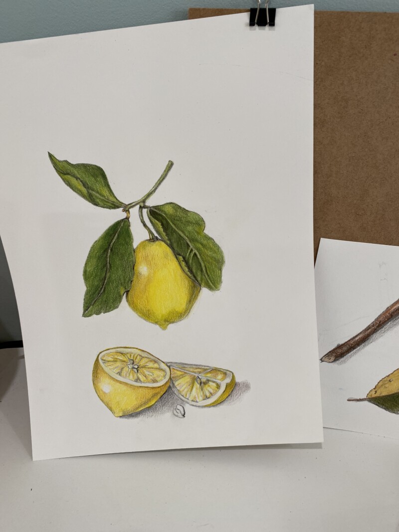
Hi Danielle- you are off to a good start. The are some areas I would revisit. You might not be able to make the changes on this drawing, but some things to keep in mind for the future. The first thing I noticed was the very bright, round highlights, which indicate a shiny subject and I don’t think of lemons as being shiny. I would tone down the highlights and make their shape a little more irregular. The highlight area is also the perfect place to illustrate the lemon’s texture. Speaking of highlights, the leaves could use more highlighting, especially the leaf to the left of the lemon. As that leaf is so close to the highlight on the lemon I particularly expect highlights on that leaf. Yellow subjects are challenging! One of the biggest challenges is not getting the color muddy where the shadows are. Using a green or gold for the grisailles toning layer (rather than dark sepia or another grey) helps keep the vibrancy of the yellows and still provides form. I hope this helps!
Hi Danielle- you are off to a good start. The are some areas I would revisit. You might not be able to make the changes on this drawing, but some things to keep in mind for the future. The first thing I noticed was the very bright, round highlights, which indicate a shiny subject and I don’t think of lemons as being shiny. I would tone down the highlights and make their shape a little more irregular. The highlight area is also the perfect place to illustrate the lemon’s texture. Speaking of highlights, the leaves could use more highlighting, especially the leaf to the left of the lemon. As that leaf is so close to the highlight on the lemon I particularly expect highlights on that leaf. Yellow subjects are challenging! One of the biggest challenges is not getting the color muddy where the shadows are. Using a green or gold for the grisailles toning layer (rather than dark sepia or another grey) helps keep the vibrancy of the yellows and still provides form. I hope this helps!