I’m very new to this, so I’m not sure my comments will help much, and I’m anxious to hear other peoples suggestions. I actually think that the colors you used look really good, and you have a nice range of values. I agree that the perspective looks a little off. Especially where the whole lemon meets the lemon half. That side looks too straight to me. I can’t wait to see the second try!
Thank you so much for taking the time to reply! I’m going to start fresh today and see what happens. Your work is lovely! It’s amazing that you’re a newcomer. I can’t wait to see more and get deeper into Wendy’s classes.
19 May 2018
Your yellows are lovely and vibrant here, and I think you chose fine colors for the shading. It’s always a good idea to practice the same subject several times. You learn something new each time you draw it. (Your lettering is so lovely.) I think this composition is very nice, and that another go at this is not a bad idea, so you can round out those edges and get that ellipse on the cut piece just so. With some dexterous dark sepia and an eraser, you could still edit parts of that place where the 2 lemons meet, and some strategic shadows might set these in space in such a way that the ellipse is believable…. but if it were me, I’d grab some tracing paper and really get the composition the way you want it, and go again.
Thank you! After a good night’s sleep, some hot coffee and dark chocolate, (fixes most everything) I started all over. The first time I used some Prismacolors because I have a limited number of Polychromos colors. Today I decided to work with only with the Polychromos that I have and nix the Prismacolors and I’m liking this go much better! Will keep going and see what happens!

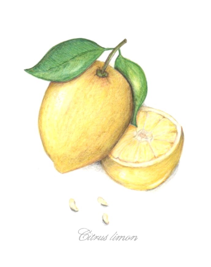
I’m very new to this, so I’m not sure my comments will help much, and I’m anxious to hear other peoples suggestions. I actually think that the colors you used look really good, and you have a nice range of values. I agree that the perspective looks a little off. Especially where the whole lemon meets the lemon half. That side looks too straight to me. I can’t wait to see the second try!
Thank you so much for taking the time to reply! I’m going to start fresh today and see what happens. Your work is lovely! It’s amazing that you’re a newcomer. I can’t wait to see more and get deeper into Wendy’s classes.
Your yellows are lovely and vibrant here, and I think you chose fine colors for the shading. It’s always a good idea to practice the same subject several times. You learn something new each time you draw it. (Your lettering is so lovely.) I think this composition is very nice, and that another go at this is not a bad idea, so you can round out those edges and get that ellipse on the cut piece just so. With some dexterous dark sepia and an eraser, you could still edit parts of that place where the 2 lemons meet, and some strategic shadows might set these in space in such a way that the ellipse is believable…. but if it were me, I’d grab some tracing paper and really get the composition the way you want it, and go again.
Thank you! After a good night’s sleep, some hot coffee and dark chocolate, (fixes most everything) I started all over. The first time I used some Prismacolors because I have a limited number of Polychromos colors. Today I decided to work with only with the Polychromos that I have and nix the Prismacolors and I’m liking this go much better! Will keep going and see what happens!