Dee, love the cut section here. I think you could still practice ellipses a bit more. When the subject is tilted like that, the ellipse will be more elongated and less like a circle. Nice leaves and roots. For you, I might recommend experimenting with some other neutrals to do your first layers of toning. Dark sepia may be a little too dark for some of these elements. I recommend starting with Red Violet on a red form like a radish, and Chrome Oxide Green on a leaf. Then once you add some saturation, go in with Dark Sepia later on just to accent the darkest of places. That way your drawings will feel a bit brighter overall. It varies from person to person, but I think some of us have a heavier hand (myself included) with the Dark Sepia, and it sometimes helps to wait and add it later on, especially on bright leaves and reds/yellows. Try it out and experiment and let me know what you think. Your work is looking so awesome, and oh! Yes! I want you to tell us about your lettering process! 😀

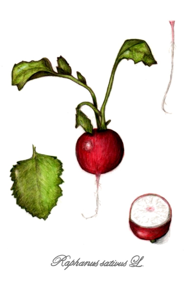
Dee, love the cut section here. I think you could still practice ellipses a bit more. When the subject is tilted like that, the ellipse will be more elongated and less like a circle. Nice leaves and roots. For you, I might recommend experimenting with some other neutrals to do your first layers of toning. Dark sepia may be a little too dark for some of these elements. I recommend starting with Red Violet on a red form like a radish, and Chrome Oxide Green on a leaf. Then once you add some saturation, go in with Dark Sepia later on just to accent the darkest of places. That way your drawings will feel a bit brighter overall. It varies from person to person, but I think some of us have a heavier hand (myself included) with the Dark Sepia, and it sometimes helps to wait and add it later on, especially on bright leaves and reds/yellows. Try it out and experiment and let me know what you think. Your work is looking so awesome, and oh! Yes! I want you to tell us about your lettering process! 😀