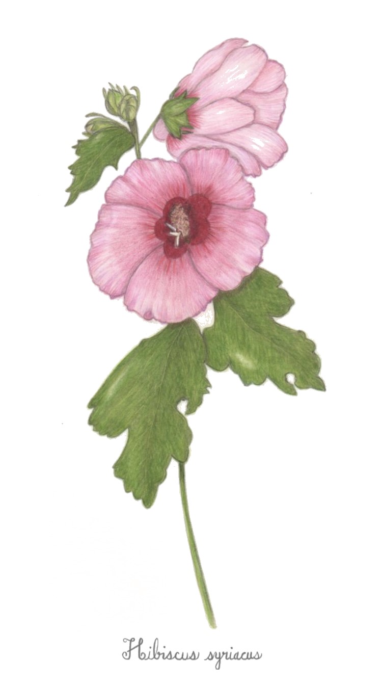
I think that the leaf in the top left corner, and the bud on top have nice realistic margins like Wendy was talking about in the webinar. And overall, I think that the margins of the whole drawing are improving. Very nice! One thing that stands out to me is the dark reddish center. I wonder whether those edges are really so sharp in life? Do those edges feather in to the rest of the flower when you see it in person? Just something to think about. LOVE the colors!
Oh, and the stem doesn’t seem to carry through. It seems like it should go through that negative space in that bottom leaf. (hope you are okay with me making these comments. I’m clearly a beginner too. But i think that someone else’s eye can help so much. and i know i would like more criticism of my own drawings, so I I’m practicing the golden rule 🙂 ).
I really appreciate your comments and suggestions! I took your earlier suggestion about burnishing the seed pod and leaf and I think it looks much better! I think it helps for someone else to look with fresh eyes and I take every suggestion to heart. It’s something I appreciate with this site versus a facebook group that is supportive but doesn’t really give feedback on how to improve. 🙂
I love the hand-lettering, Dee!! Pam’s comments here are great, and I agree that the leaf margins here are looking very nice. What I think this drawing needs is more dark tones to make the whole thing look more 3d; especially in the center flower and in the places where forms overlap. Nice work.

I think that the leaf in the top left corner, and the bud on top have nice realistic margins like Wendy was talking about in the webinar. And overall, I think that the margins of the whole drawing are improving. Very nice! One thing that stands out to me is the dark reddish center. I wonder whether those edges are really so sharp in life? Do those edges feather in to the rest of the flower when you see it in person? Just something to think about. LOVE the colors!
Oh, and the stem doesn’t seem to carry through. It seems like it should go through that negative space in that bottom leaf. (hope you are okay with me making these comments. I’m clearly a beginner too. But i think that someone else’s eye can help so much. and i know i would like more criticism of my own drawings, so I I’m practicing the golden rule 🙂 ).
I really appreciate your comments and suggestions! I took your earlier suggestion about burnishing the seed pod and leaf and I think it looks much better! I think it helps for someone else to look with fresh eyes and I take every suggestion to heart. It’s something I appreciate with this site versus a facebook group that is supportive but doesn’t really give feedback on how to improve. 🙂
and i love the lettering!
I love the hand-lettering, Dee!! Pam’s comments here are great, and I agree that the leaf margins here are looking very nice. What I think this drawing needs is more dark tones to make the whole thing look more 3d; especially in the center flower and in the places where forms overlap. Nice work.
Thank you!
Yay about the lettering, Vern! It wasn’t as bad as I expected! 🙂 I’ll work on the suggestions of yours and Pgthompson’s and repost later today.