Dee, this is a lovely composition! Nice job showing this plant and the way it grows. Pay attention to the places where leaves and stems attach–these are key places not only for identification, but also for clarity. That said, I think you could try for more clarity or sharpness/focus on those places here. (Magnify and draw on another sheet if necessary, to better understand the structure). You’ve done an awesome job on the stem overlaps and leaf margins! Keep highlights consistent: if you have several round, shiny forms, they will all have the highlight in the upper left corner, no matter their orientation… for example, the fruits at the top have a highlight on the bottom, and I think this will read better if those highlights move to the top left… does that make sense? I can try to do a photoshop edit if you need. I think your leaves are much improved, and your light touch is refreshing. I almost hate to say it, but I think you could bring some of those punchy darks back in! –just in a few places! Right now this drawing reads very much like all the tones are in the “mid” tone range. Try to add variation by scattering in some dark and light tones for balance. You can also vary the color and tone of your leaves just a bit, so they don’t all read as exactly the same color and tone. Just slightly, to create interest and variation, and keep our eyes moving around the page. GREAT WORK! And I am loving the handwriting.
Thanks so much, Vern, for all the fabulous suggestions! You made it all crystal clear. Now let’s see if my follow-through works. I can’t wait to start on the corrections! 🙂

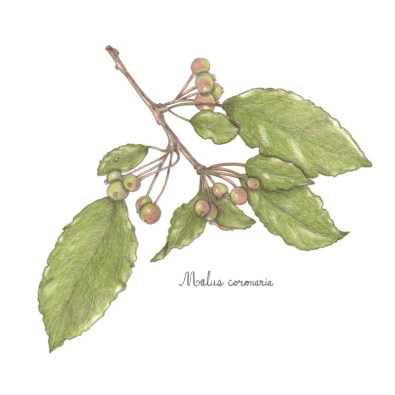
Dee, this is a lovely composition! Nice job showing this plant and the way it grows. Pay attention to the places where leaves and stems attach–these are key places not only for identification, but also for clarity. That said, I think you could try for more clarity or sharpness/focus on those places here. (Magnify and draw on another sheet if necessary, to better understand the structure). You’ve done an awesome job on the stem overlaps and leaf margins! Keep highlights consistent: if you have several round, shiny forms, they will all have the highlight in the upper left corner, no matter their orientation… for example, the fruits at the top have a highlight on the bottom, and I think this will read better if those highlights move to the top left… does that make sense? I can try to do a photoshop edit if you need. I think your leaves are much improved, and your light touch is refreshing. I almost hate to say it, but I think you could bring some of those punchy darks back in! –just in a few places! Right now this drawing reads very much like all the tones are in the “mid” tone range. Try to add variation by scattering in some dark and light tones for balance. You can also vary the color and tone of your leaves just a bit, so they don’t all read as exactly the same color and tone. Just slightly, to create interest and variation, and keep our eyes moving around the page. GREAT WORK! And I am loving the handwriting.
Thanks so much, Vern, for all the fabulous suggestions! You made it all crystal clear. Now let’s see if my follow-through works. I can’t wait to start on the corrections! 🙂