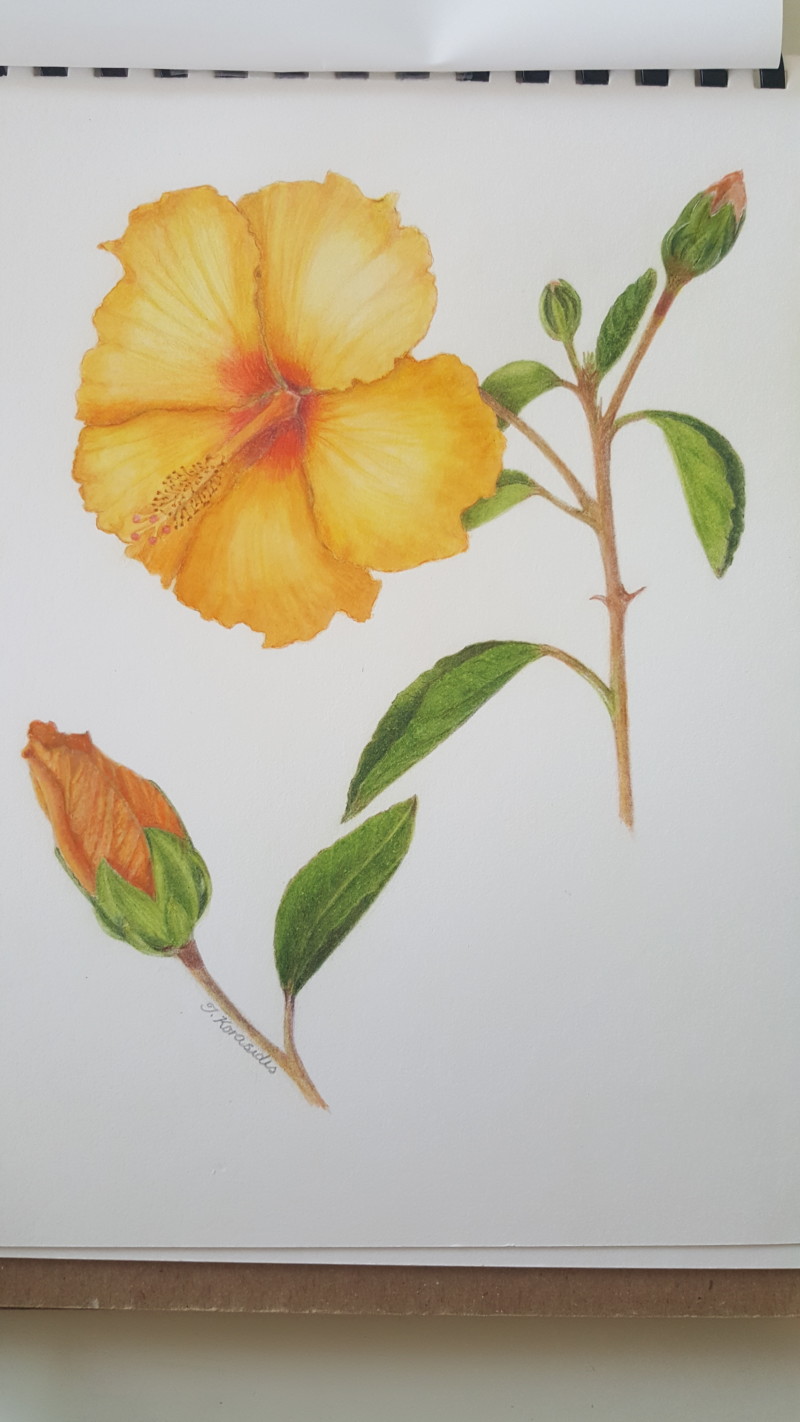
I overworked parts of this as I struggled to get the light right on the leaves. It could be totally wrong anyway on the bottom leaf. Also struggled to get the right colour so I used watercolour as well. I think I was far too ambitious with this attempt but I did learn a lot trying.
Hi Dora- this drawing is bringing me back to Hawaii! There were Hibiscus everywhere! Your rendering is really well done and I love the details on the buds. I think the leaves look good and you could have done even less detail on them if you wanted because the star of the page is the flower. The flower is beautiful and the colors are great, but it reads a little flat. Even though the flower is facing the light source it still needs some dark toning to give some areas depth. I would tone in the well area and also I would expect the filament column to cast a shadow onto the petal below it. The stems need some toning for form and also the stems and leaves behind the flower would be in shadow. This is so close! Great job!
Thanks Doug. I will make these changes. Will be giving this drawing to my sister in law as she lives in Greece and is here for a short time. This hibisbus is growing in a pot on my mother-in-law’s deck so hopefully it can remind her of Australia. What colours do I use for the toning. Would the sepia be too dark?
Hi Dora- sorry I missed your question. Whatever you used worked! The center looks great now. See my note on your new post about the shadow from the column.