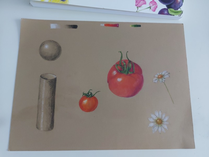
MY first attempt at the kraft paper. I need to watch more of the second lesson on drawing white flowers. Hopefully my second attempt will be better. I kept forgetting about the tone of the craft paper and had to erase somewhat at the end. It was so much fun learning and attempting something new though.
Hi Theodora, Yes, it takes some time and practice to figure out how you want to use the color/value of the Kraft paper. I’ve been struggling myself with that one. I especially have trouble with the with the white or light colored subjects. I used my eraser quite a bit. These drawings look like you are figuring it out. I think one of the problems can be that the brown of the paper is very warm and sometimes you are looking for a cooler hue.
Yes, Theodora, indeed looks like you are finding your way. These look great. Some artists build up an underlayer of white (but stilll leave some Kraft paper showing in some areas) and then layer colours on top of that. Some folks enjoy using a white prismacolor pencil as a drawing or base layer. I like pushing my darks darker – since I’m on a midtone paper I have to increase my contrast. Those reds read very well on this Kraft paper – it looks exaclty like the tomato colour I see.
MY first attempt at the kraft paper. I need to watch more of the second lesson on drawing white flowers. Hopefully my second attempt will be better. I kept forgetting about the tone of the craft paper and had to erase somewhat at the end. It was so much fun learning and attempting something new though.
Hi Theodora, Yes, it takes some time and practice to figure out how you want to use the color/value of the Kraft paper. I’ve been struggling myself with that one. I especially have trouble with the with the white or light colored subjects. I used my eraser quite a bit. These drawings look like you are figuring it out. I think one of the problems can be that the brown of the paper is very warm and sometimes you are looking for a cooler hue.
I practiced my doing some drawings with only a white pencil.
Yes, Theodora, indeed looks like you are finding your way. These look great. Some artists build up an underlayer of white (but stilll leave some Kraft paper showing in some areas) and then layer colours on top of that. Some folks enjoy using a white prismacolor pencil as a drawing or base layer. I like pushing my darks darker – since I’m on a midtone paper I have to increase my contrast. Those reds read very well on this Kraft paper – it looks exaclty like the tomato colour I see.