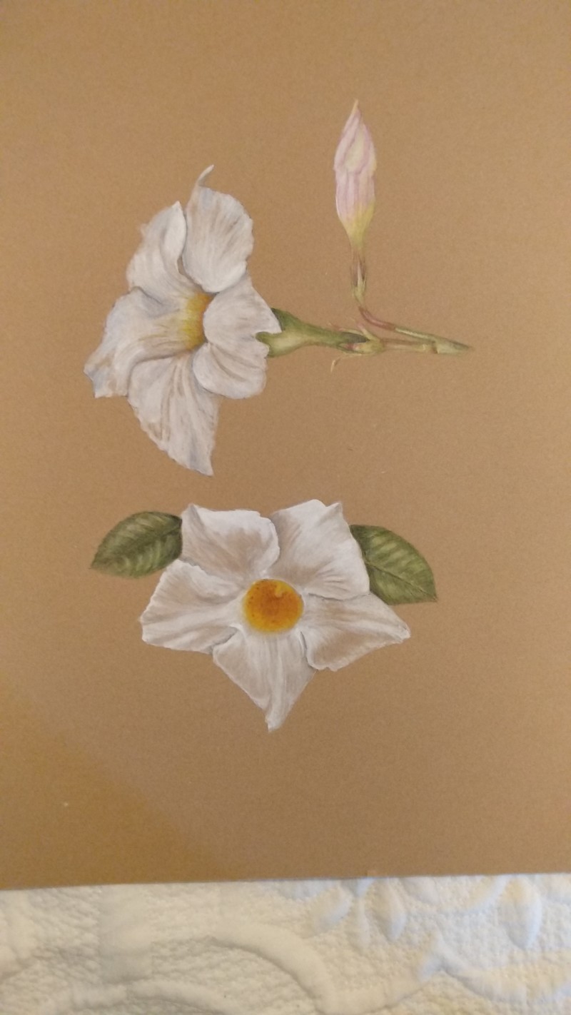
Lovely! Was this all watercolor? I like the way you have used the tone of the Kraft paper to achieve the values. Especially on the bottom one. That technique takes control. It is so easy to overdo the white.
Thanks Katy. I’m just practicing ATM on Kraft paper. From memory the bottom one is mostly water colour and my second attempt. I watched Wendy’s lesson and it sunk in a bit better on my second try about using the tone of the craft paper to show shadows. I’m not too successful with leaves on Kraft paper and feel a little lost there but it is fun and challenging trying something new.
25 February 2021
Those petals on the bottom flower are absolutely stunning, Dora!!!!! Wow. Re: leaves, I would create more of a hierarchy in the highlights there; right now, there are many highlights that are all at the same value; try choosing just 2 or 3 highlights and keep them super white, then tone down some of the others–they can still be lighter than the leaf color if you like, but just not as bright as the main highlights. Does that make sense? I think this will help you create more realistic looking leaves.
Lovely! Was this all watercolor? I like the way you have used the tone of the Kraft paper to achieve the values. Especially on the bottom one. That technique takes control. It is so easy to overdo the white.
Thanks Katy. I’m just practicing ATM on Kraft paper. From memory the bottom one is mostly water colour and my second attempt. I watched Wendy’s lesson and it sunk in a bit better on my second try about using the tone of the craft paper to show shadows. I’m not too successful with leaves on Kraft paper and feel a little lost there but it is fun and challenging trying something new.
Those petals on the bottom flower are absolutely stunning, Dora!!!!! Wow. Re: leaves, I would create more of a hierarchy in the highlights there; right now, there are many highlights that are all at the same value; try choosing just 2 or 3 highlights and keep them super white, then tone down some of the others–they can still be lighter than the leaf color if you like, but just not as bright as the main highlights. Does that make sense? I think this will help you create more realistic looking leaves.
Thanks for the feedback Vern. I shall give leaves on craft paper a few more tries…