Yes, this is a better photo, but I’m guessing it doesn’t do your drawing justice. Still, it looks great. Nice drawing on those complicated forms. Especially the leaves. I’d like to see you use more of the Kraft paper tone in your rendering, so it integrates into the drawing. Also watch your use of white. As the highlights on the flowers go further away from the brightest part of the drawing they will darken. use those bright whites judiciously.
25 February 2021
Kraft paper color is very finicky in photographs and scans…. This photo captures the drawing better, and I think that’s what’s most important.
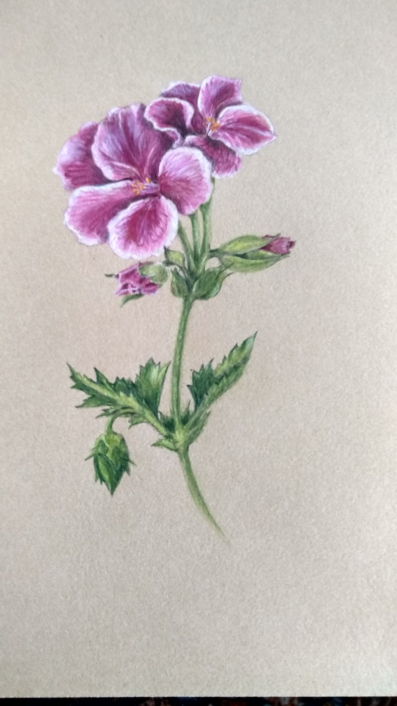
Better photo of the flower but now Kraft paper colour didn’t photograph well???
Yes, this is a better photo, but I’m guessing it doesn’t do your drawing justice. Still, it looks great. Nice drawing on those complicated forms. Especially the leaves. I’d like to see you use more of the Kraft paper tone in your rendering, so it integrates into the drawing. Also watch your use of white. As the highlights on the flowers go further away from the brightest part of the drawing they will darken. use those bright whites judiciously.
Kraft paper color is very finicky in photographs and scans…. This photo captures the drawing better, and I think that’s what’s most important.