Hi Douglass- you are off to a great start! The color and saturation are very good! I am glad you included a photo. I see some things in the photo that, if added, would benefit your drawing. I see mid and dark tones on the persimmon in the photograph that I do not see on your drawing. Adding those tones will help emphasize the round form. I also see four distinct sections on the cap and I would correct that on your drawing. It is important information about the life cycle of the persimmon. I see that the cap does cast a shadow on the persimmon in places and I would also add some dark toning on the left side of the well area to convey the depth of the well. Check out where the stem attached. I think it could have more presence that what you have shown.
Hi Douglass- I was looking at the photo again and noticed there is really nice variety of greens on the cap, which would make a nice addition to your drawing!
I agree with Doug about your missing the darks and mid tones. From looking at the photo, I’m seeing some areas of dark value in the sepals. I’d use a little indigo to achieve those darks. Always think about the light source. You’ve got a good hightlight on the body of the fruit. Think of the sepal area as a shallow cup or “well” as Doug says. There would be more shadow on the left inside edge. And as Doug also mentioned, the cast shadow of the sepals would help define the shape.
02 December 2021
Excellent bright, saturated orange color here, Douglass! Wow.
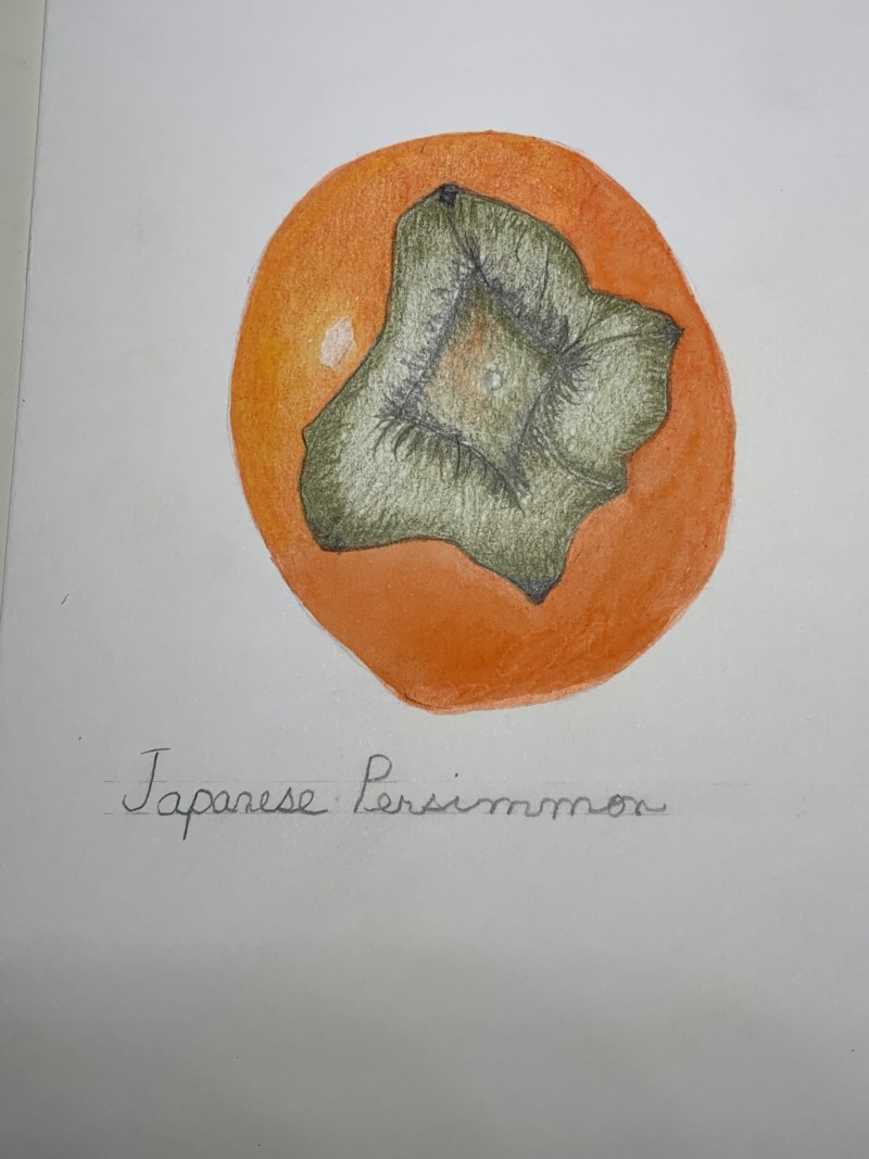
Hi Douglass- you are off to a great start! The color and saturation are very good! I am glad you included a photo. I see some things in the photo that, if added, would benefit your drawing. I see mid and dark tones on the persimmon in the photograph that I do not see on your drawing. Adding those tones will help emphasize the round form. I also see four distinct sections on the cap and I would correct that on your drawing. It is important information about the life cycle of the persimmon. I see that the cap does cast a shadow on the persimmon in places and I would also add some dark toning on the left side of the well area to convey the depth of the well. Check out where the stem attached. I think it could have more presence that what you have shown.
Hi Douglass- I was looking at the photo again and noticed there is really nice variety of greens on the cap, which would make a nice addition to your drawing!
I agree with Doug about your missing the darks and mid tones. From looking at the photo, I’m seeing some areas of dark value in the sepals. I’d use a little indigo to achieve those darks. Always think about the light source. You’ve got a good hightlight on the body of the fruit. Think of the sepal area as a shallow cup or “well” as Doug says. There would be more shadow on the left inside edge. And as Doug also mentioned, the cast shadow of the sepals would help define the shape.
Excellent bright, saturated orange color here, Douglass! Wow.
Yes that great orange colour really pulls us in – and I like your writing here very much.