Hi Cibyl- I especially like seeing this pear in proximity to the other pear. This pear looks like it is deflated – an interesting contrast to your previous version. The dark toning on the right side is too uniform in tone. It should start darker at the edge and have some range of tones as it transitions toward the light source. The dark patches on the lower left, which I am assuming are blemishes are particularly distracting because you don’t have the required dark shadow toning on the right side. In addition to adding the dark toning on the right I would lighten the blemishes on the left so they are not so prominent. If the pear was actually not as deflated as it appears here I think softening that strong contrast line that divides the top half of the pear and also soften the dip on the right edge.
Haha. Now I’m seeing the winking eye, and the blemish on the bottom right looks like a little smirky smile 🙂 I like how you are showing the 3 dimensional form by rendering the pear lighter on the left, and then getting darkest on the right. Good job! Sometimes when we light a subject, especially if the light is very close to the subject, we can see shadows that are very dark and abrupt, instead of soft and gradual. It can help to have your light back a bit from the subject to get those nice soft shadows. Even if you are seeing really dark, abrupt shadows, you’ll want to try to render them more gradually, and think about how the light will be hitting the form in that shadow area. Think about how you would tone a sphere, getting those 9 values in. That’s what you want to be (generally) thinking about when you are toning the bottom round part of a pear. And then keep in mind how you would tone a cylinder with 9 values, and then keep that in mind while toning that top, narrow part of the pear. It’s such an adorable pear. I want to wink back at it 🙂

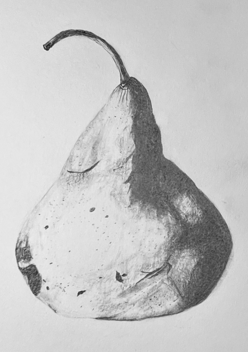
Hi Cibyl- I especially like seeing this pear in proximity to the other pear. This pear looks like it is deflated – an interesting contrast to your previous version. The dark toning on the right side is too uniform in tone. It should start darker at the edge and have some range of tones as it transitions toward the light source. The dark patches on the lower left, which I am assuming are blemishes are particularly distracting because you don’t have the required dark shadow toning on the right side. In addition to adding the dark toning on the right I would lighten the blemishes on the left so they are not so prominent. If the pear was actually not as deflated as it appears here I think softening that strong contrast line that divides the top half of the pear and also soften the dip on the right edge.
It was a strange shaped pear….that one blemish toward the top on the left keeps looking like a winking eye to me. LOL
Haha. Now I’m seeing the winking eye, and the blemish on the bottom right looks like a little smirky smile 🙂 I like how you are showing the 3 dimensional form by rendering the pear lighter on the left, and then getting darkest on the right. Good job! Sometimes when we light a subject, especially if the light is very close to the subject, we can see shadows that are very dark and abrupt, instead of soft and gradual. It can help to have your light back a bit from the subject to get those nice soft shadows. Even if you are seeing really dark, abrupt shadows, you’ll want to try to render them more gradually, and think about how the light will be hitting the form in that shadow area. Think about how you would tone a sphere, getting those 9 values in. That’s what you want to be (generally) thinking about when you are toning the bottom round part of a pear. And then keep in mind how you would tone a cylinder with 9 values, and then keep that in mind while toning that top, narrow part of the pear. It’s such an adorable pear. I want to wink back at it 🙂
Thank you!