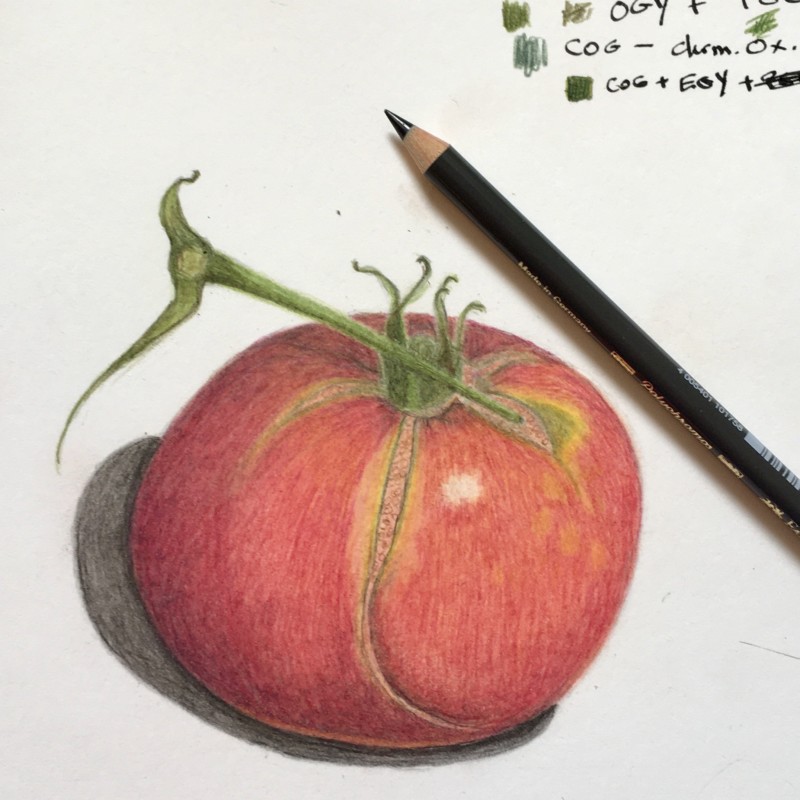
Here is another try at a tomato. This one has deep cracks in it. I have noticed that I am having difficulty with the paper shredding a bit after I get lots of layers on there. It is sort of a very soft ‘nap’ of little fibers coming up. What am I doing wrong?
Also, I have noticed a little white line dividing two parts of the drawing, like there the red tomato meets the green stem. Why is that happening and what do I do about it?
Do you have a Muji crank sharpener? They really make a huge difference. The long sharp pencils allow us to draw softer and build up the layers. Do you use Wendy’s cold press paper? Looks like you are a lefty, yes? I’d lighten that shadow, it’s too overwhelming – we want it to be a supportive player – not the main one. If you use watercolour make sure you allow it to dry so you don’t overwork the paper. And I think you could bring in some dark sepia to darker the shadow parts of the sepals and stem, and use your red violet and then add in some dark sepia to darken your fruit. It’s a great drawing!
Those cracks look great. I like how you get a little peek into the flesh of the tomato through the lovely cracks. I’m anxious to here what others have to say about the paper and the soft fibers coming up. I had this problem too when I used Stonehenge legion HP paper. I think I have too heavy of a hand for it.
I agree that the crack looks so cool, Eleanor! Re: paper, we’ve recently gotten some more feedback from folks about this paper, and it seems like, you know, some people like this paper and others don’t. If you’re feeling like you need a more “resilient” paper, you could try a more hefty hot press paper like Fabriano Artistico or Arches. We like Stonehenge Aqua because it allows us to work quickly and get good results. But if your style is a little different, try out some other papers, but we recommend hot press, for sure. I think those white bits you’re noticing are literally teeny empty spaces between the red and the green. And to work on them, you’ll need a very sharp pencil, and literally “fill in” those white spaces with the tip of your pencil to make sure that the red and the green really do meet and touch each other.
Here is another try at a tomato. This one has deep cracks in it. I have noticed that I am having difficulty with the paper shredding a bit after I get lots of layers on there. It is sort of a very soft ‘nap’ of little fibers coming up. What am I doing wrong?
Also, I have noticed a little white line dividing two parts of the drawing, like there the red tomato meets the green stem. Why is that happening and what do I do about it?
Really like this, lovely colours, your paper challenges aside!
Do you have a Muji crank sharpener? They really make a huge difference. The long sharp pencils allow us to draw softer and build up the layers. Do you use Wendy’s cold press paper? Looks like you are a lefty, yes? I’d lighten that shadow, it’s too overwhelming – we want it to be a supportive player – not the main one. If you use watercolour make sure you allow it to dry so you don’t overwork the paper. And I think you could bring in some dark sepia to darker the shadow parts of the sepals and stem, and use your red violet and then add in some dark sepia to darken your fruit. It’s a great drawing!
Those cracks look great. I like how you get a little peek into the flesh of the tomato through the lovely cracks. I’m anxious to here what others have to say about the paper and the soft fibers coming up. I had this problem too when I used Stonehenge legion HP paper. I think I have too heavy of a hand for it.
(Here was supposed to be hear)
I agree that the crack looks so cool, Eleanor! Re: paper, we’ve recently gotten some more feedback from folks about this paper, and it seems like, you know, some people like this paper and others don’t. If you’re feeling like you need a more “resilient” paper, you could try a more hefty hot press paper like Fabriano Artistico or Arches. We like Stonehenge Aqua because it allows us to work quickly and get good results. But if your style is a little different, try out some other papers, but we recommend hot press, for sure. I think those white bits you’re noticing are literally teeny empty spaces between the red and the green. And to work on them, you’ll need a very sharp pencil, and literally “fill in” those white spaces with the tip of your pencil to make sure that the red and the green really do meet and touch each other.