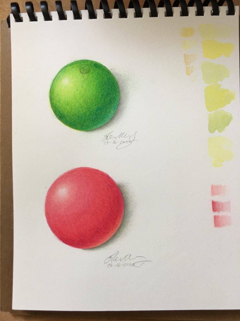
Beautifully done! Such sensitive toning! My only comments would be that I would like to see some soothing on the transition from the darkest tones to the mid tones on the red sphere. I’m seeing a line. I would bring the dark value up gradually. I think you could also add some cool darks to get a more full range of value. That would go for the green sphere too. With the green try use a complimentary color for the deep shadow.
Beautifully done! Such sensitive toning! My only comments would be that I would like to see some soothing on the transition from the darkest tones to the mid tones on the red sphere. I’m seeing a line. I would bring the dark value up gradually. I think you could also add some cool darks to get a more full range of value. That would go for the green sphere too. With the green try use a complimentary color for the deep shadow.
Now that you mention it, I see that line too. Thanks for the suggestions on cool and complementary hues. I will try that on my next practice.
I love your reflective highlighting. Just looking at yours has given me inspiration.
Beautiful, smooth toning on this red sphere!! And you’re right; that reflective highlight is so nice and glowy.