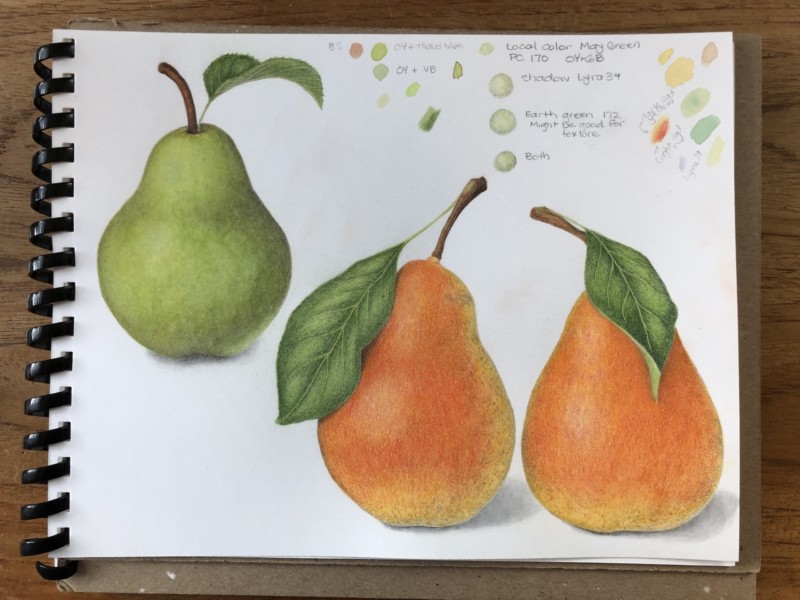
Great job Erin!!! I think you could use more dark toning on the two pears on the right to emphasize their form. Like you did so well with the green pear! Don’t use the dark sepia if you do add more toning because it could muddy those beautiful colors. I would also lighten the highlight on the green pear. Right now the reflected highlight is brighter than the main highlight. By the way, your reflected highlights are very good!!!!
Great job Erin!!! I think you could use more dark toning on the two pears on the right to emphasize their form. Like you did so well with the green pear! Don’t use the dark sepia if you do add more toning because it could muddy those beautiful colors. I would also lighten the highlight on the green pear. Right now the reflected highlight is brighter than the main highlight. By the way, your reflected highlights are very good!!!!
Thank you Doug!
Nice page!