Nice graphite study, Ethel! And I love your note about it coming from your dad’s tree. It’s a nice drawing, and there are a few places that I’d take a look at. You want to try to get at least nine values to be able to give the illusion of three dimensional form. Think about the toning a sphere exercise. To may eye, this has about 4-5 values, mostly in midtones. I can’t tell if the main highlight is toned in a bit, or if the photo is just bit dark, making the white of the paper look gray. If the main highlight isn’t the white of the paper, I would use a kneaded eraser to lift out some graphite from that highlight. I’m only seeing one value on the left side of the apple before you get the main highlight. You may want to lift out bit of toning to the left of that highlight, And try to slowly, gradually build layers to try to get more light values in that area, fading gradually into the highlight. Then to the right of the highlight, you can get more values, getting darker and darker as you build toward that core shadow, which could be much darker. And then, your reflected highlight should be darker than your main highlight. The reflected highlight is light that bounced off the surface back onto your form. That light loses energy during that trip. So it will be darker than your highlights that receive direct light. I know it sounds like a lot, but you really off to a wonderful start. Get those values in there, and you will see this become much more three dimensional. It can help to practice by toning smallish spheres over and over again to get the hang of putting in all of those values. Keep up the good work!!!
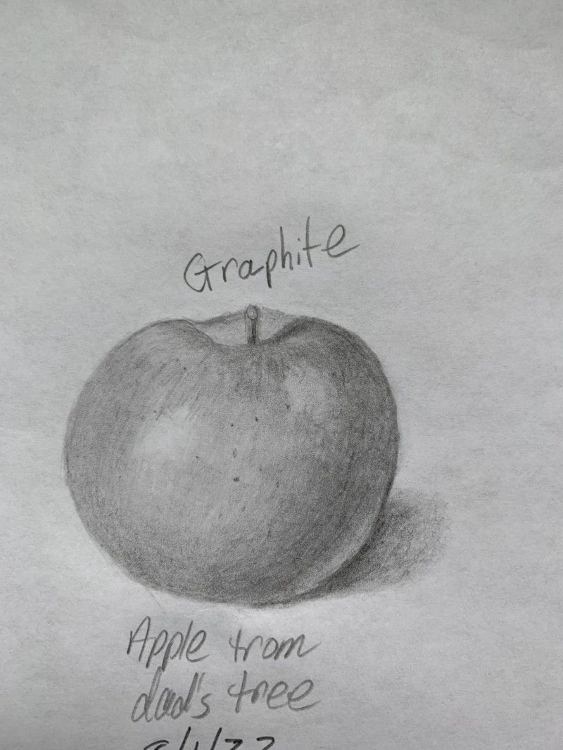
This is an apple I did on copy paper using graphite pencil. I did this before doing the apple twice using watercolors and colored pencils.
Nice graphite study, Ethel! And I love your note about it coming from your dad’s tree. It’s a nice drawing, and there are a few places that I’d take a look at. You want to try to get at least nine values to be able to give the illusion of three dimensional form. Think about the toning a sphere exercise. To may eye, this has about 4-5 values, mostly in midtones. I can’t tell if the main highlight is toned in a bit, or if the photo is just bit dark, making the white of the paper look gray. If the main highlight isn’t the white of the paper, I would use a kneaded eraser to lift out some graphite from that highlight. I’m only seeing one value on the left side of the apple before you get the main highlight. You may want to lift out bit of toning to the left of that highlight, And try to slowly, gradually build layers to try to get more light values in that area, fading gradually into the highlight. Then to the right of the highlight, you can get more values, getting darker and darker as you build toward that core shadow, which could be much darker. And then, your reflected highlight should be darker than your main highlight. The reflected highlight is light that bounced off the surface back onto your form. That light loses energy during that trip. So it will be darker than your highlights that receive direct light. I know it sounds like a lot, but you really off to a wonderful start. Get those values in there, and you will see this become much more three dimensional. It can help to practice by toning smallish spheres over and over again to get the hang of putting in all of those values. Keep up the good work!!!
Thank you, @Pam. I make the corrections.