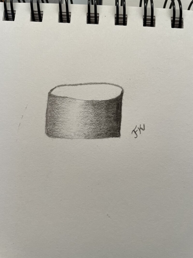
Nice job Frieda! You have a good range of tones. A couple of areas to revisit. The highlight should be the color of the paper and the areas flanking the highlight could be a little lighter. You may have to alter some of the other tones once you correct that. Also the highlight could be a little more to the left – it is almost in the center. The bottom edge should not be flat, but it should be the same curve as the top front edge.
Nice job Frieda! You have a good range of tones. A couple of areas to revisit. The highlight should be the color of the paper and the areas flanking the highlight could be a little lighter. You may have to alter some of the other tones once you correct that. Also the highlight could be a little more to the left – it is almost in the center. The bottom edge should not be flat, but it should be the same curve as the top front edge.