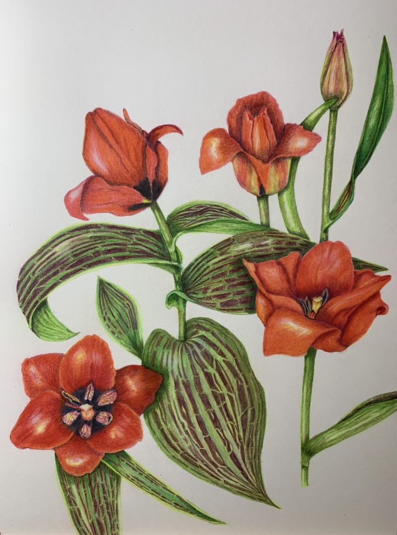
Theresia, this is beautiful! I love the bright saturated colors. Those variegated leaves are so interesting, You did a lovely job of showing the twists and curves of those leaves. You might want to consider toning down the highlights on some of your petals. The flower that is open on the upper right: the highlights on the left and right petal are about the same level of white, I would tone down the one on the right. Similar thing is going on with the flower on the lower left: all of those highlights seem to be about the same level of white, Keeping your light source in mind, tone down the highlights that aren’t your main highlight. Compositionally, I love all of the graceful curves in your drawing. They really help move the eye around the page. So I think that if you had drawn that straight stem on the right with a little more of a curve to it, it would blend in to this lovely composition a bit more. Do you see what I mean? Just something to think about in your next drawing. But this is really nice, Rita. Bravo.
Thank you Pam! Should I see the whole blossom as one object like a sphere? So I place the main highlight like I would ( more or less) on the sphere? That’s good advice as I got a little confused about the possibilities of highlights a plant can offer with their various amount of petals, I guess! 🙃 I keep the curvy stem in mind (definitely!) My tulip was a very proud one, it didn’t feel right this time. Thanks a lot for your kind advice! Theresia
Oh, sorry Pam. I see what you mean. You mean the small tulip above on the right. It’s a straight line through the whole paige! That’s very boring. Right! Won‘t happen again. Thanks!